All Components
Every component in Delacour UI Native, grouped by what it does.
Nineteen components, each on its own import subpath. There is no package-wide barrel — that is what lets an app skip resolving optional peers it never uses.
Or own the source instead
Every component here can be copied into your own repository with the
delacour CLI — bunx delacour@latest add button. The name after add is the
same one as the import subpath. Same components, different delivery: you edit the file rather than
upgrade a package.
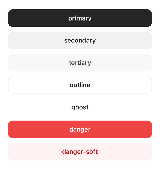
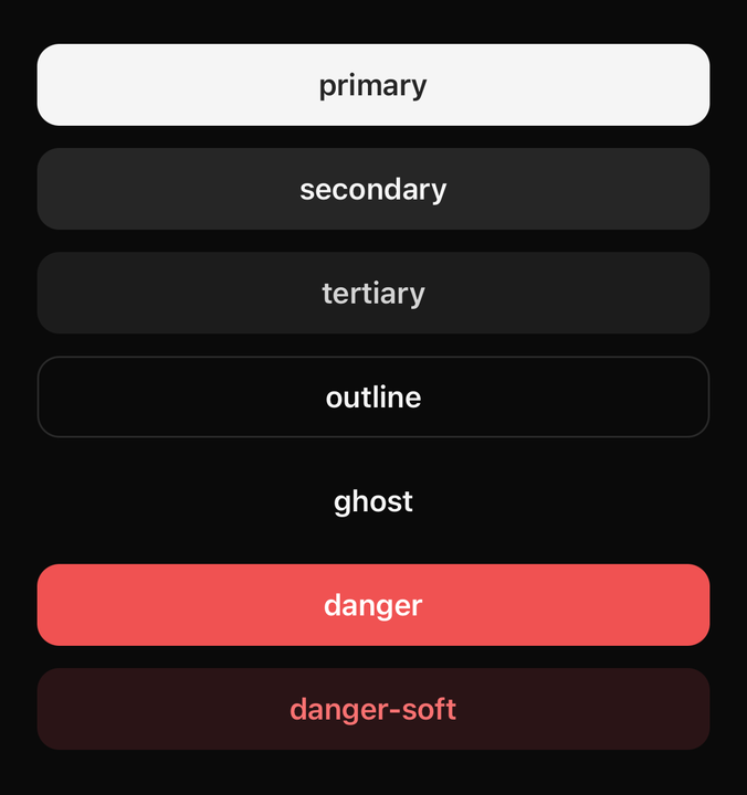
Actions
Forms
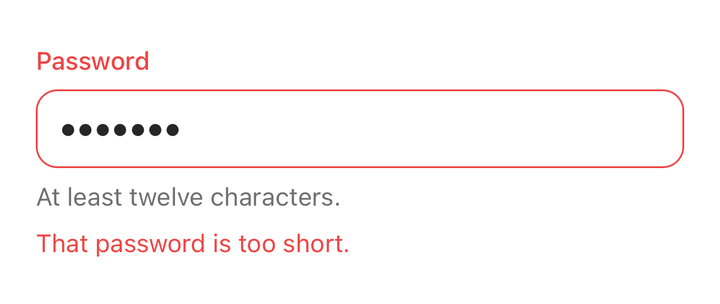
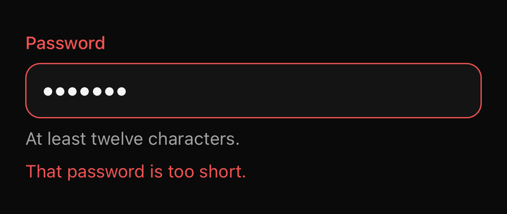
FieldA form field's layout, and the one place its state is written down.
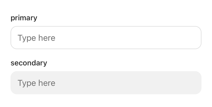
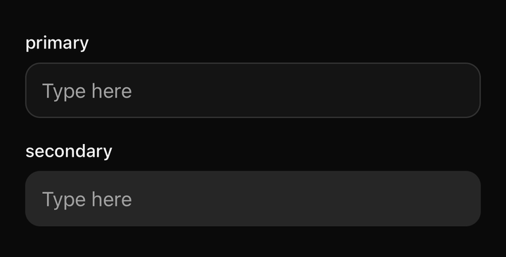
InputA text field, and the box that can hold content beside it.
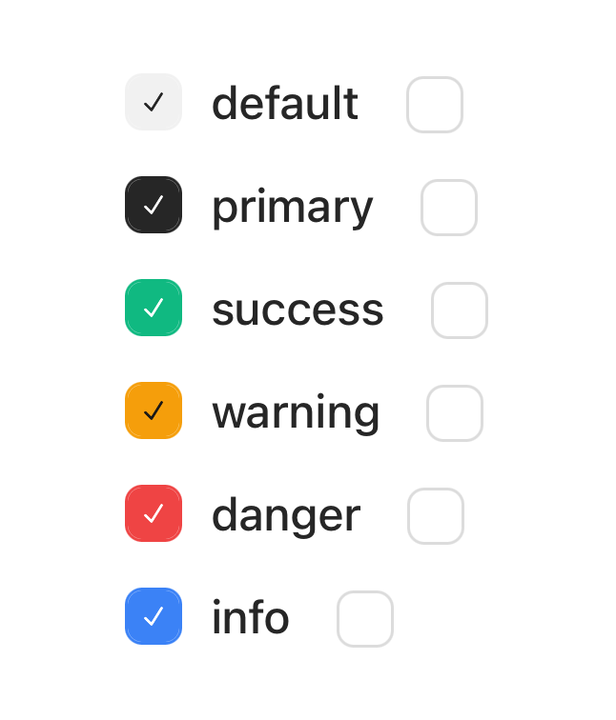
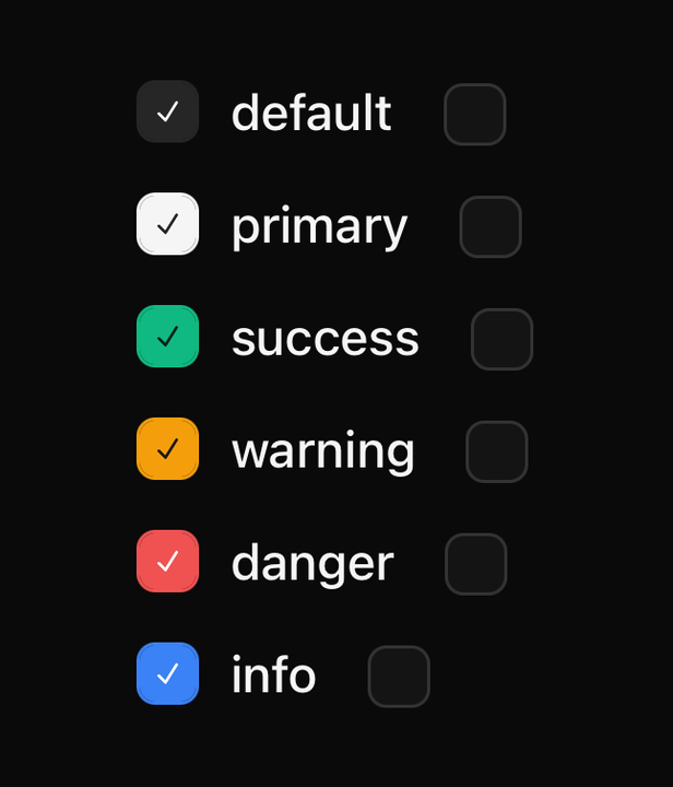
CheckboxA box that is ticked or not — alone, or as one of a group sharing a value list.
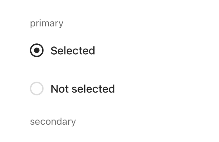
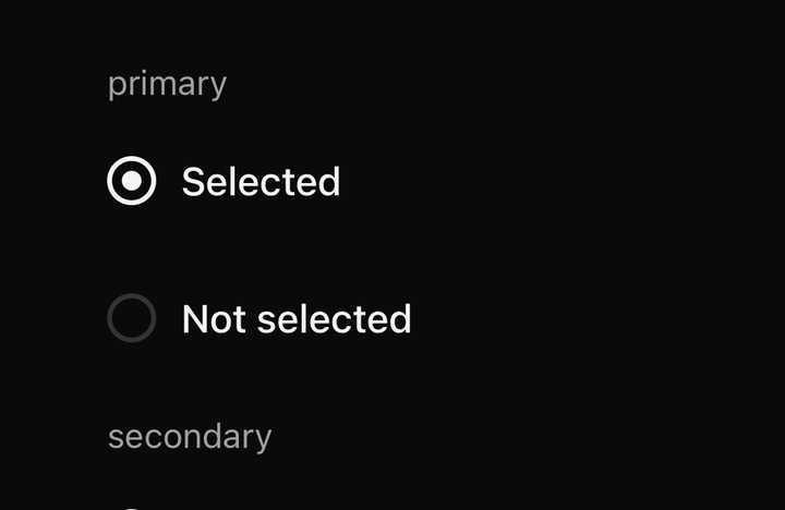
RadioOne choice from a set, with a trailing indicator row.
SwitchAn on/off control with a thumb you can drag as well as tap.
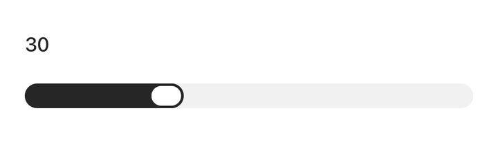
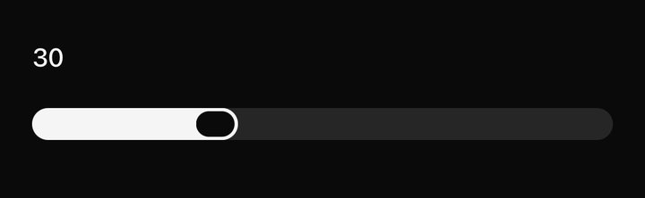
SliderA value picked from a range by dragging a handle along a track.
Data display
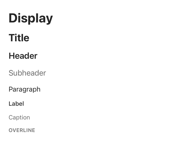
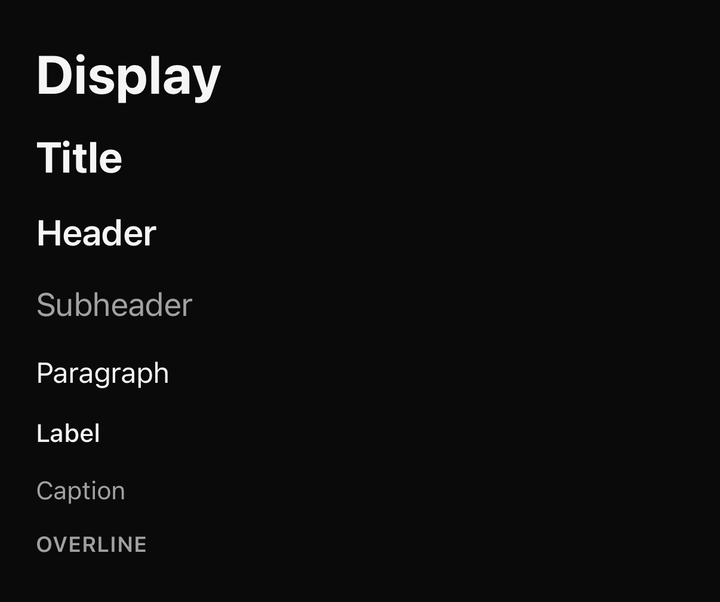
TextThe type scale, and the one component that reproduces React Native's text inheritance.
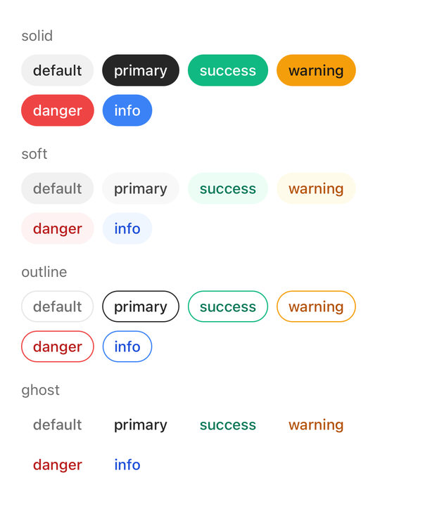
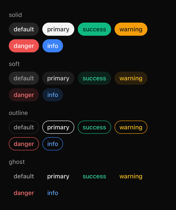
BadgeA compact label for status, category or count.
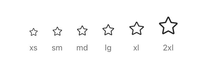
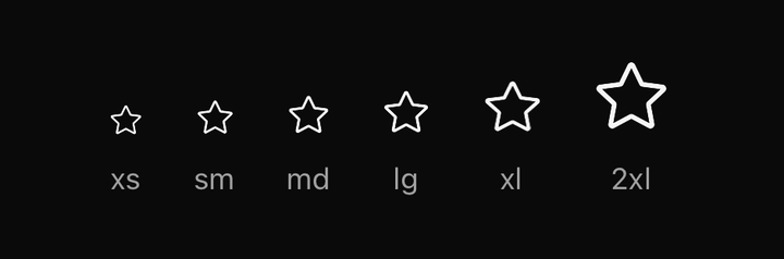
IconCentral Icons, sized and coloured by inheritance.
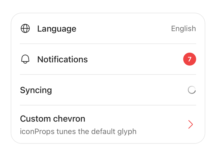
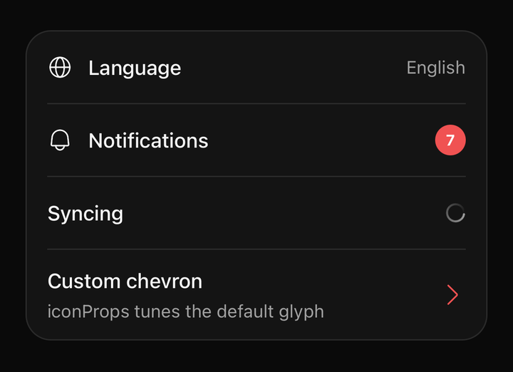
ListGroupA surface grouping related rows, with dividers inserted for you.
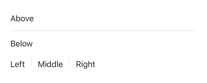
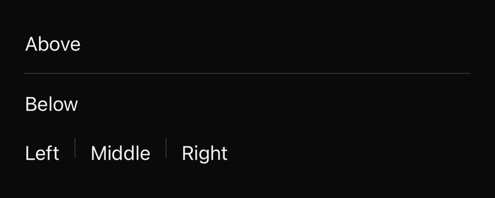
SeparatorA one-pixel rule, hidden from assistive technology.
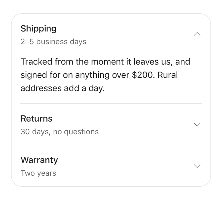
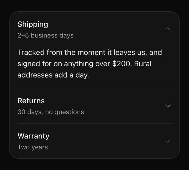
AccordionSections that expand and collapse, animated from a measured height.