Separator
A one-pixel rule, hidden from assistive technology.
import { Separator } from "@delacour/native-ui/separator";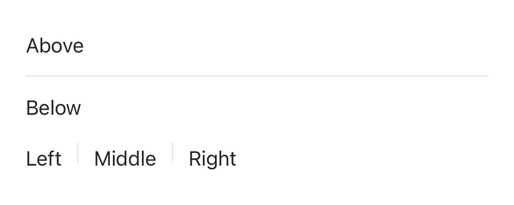
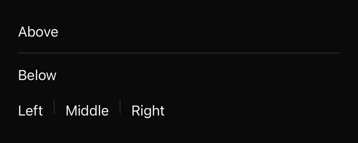
import { Separator } from "@delacour/native-ui/separator";import { Text } from "@delacour/native-ui/text";import type { ReactElement } from "react";import { View } from "react-native";export function Demo(): ReactElement { return ( <View className="gap-4"> <View className="gap-3"> <Text.Paragraph>Above</Text.Paragraph> <Separator /> <Text.Paragraph>Below</Text.Paragraph> </View> <View className="flex-row items-center gap-3"> <Text.Paragraph>Left</Text.Paragraph> <Separator className="h-4" orientation="vertical" /> <Text.Paragraph>Middle</Text.Paragraph> <Separator className="h-4" orientation="vertical" /> <Text.Paragraph>Right</Text.Paragraph> </View> </View> );}<Separator />
<Separator orientation="vertical" />It is hidden from assistive technology: a line between every row carries nothing a screen reader can use, and announcing them buries the rows.
API
Prop
Type
Two rules it follows
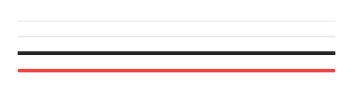
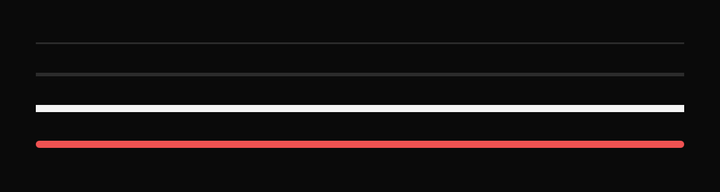
import { Separator } from "@delacour/native-ui/separator";import type { ReactElement } from "react";import { View } from "react-native";export function Demo(): ReactElement { return ( <View className="gap-4"> <Separator /> <Separator className="h-0.5" /> <Separator className="h-1 bg-primary" /> <Separator className="h-1 rounded-full bg-danger" /> </View> );}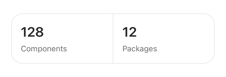
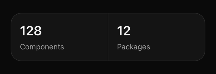
import { Separator } from "@delacour/native-ui/separator";import { Text } from "@delacour/native-ui/text";import type { ReactElement } from "react";import { View } from "react-native";export function Demo(): ReactElement { return ( <View className="flex-row items-stretch rounded-2xl border border-border bg-card"> <View className="flex-1 gap-1 p-4"> <Text className="font-semibold text-2xl text-card-foreground">128</Text> <Text.Caption>Components</Text.Caption> </View> <Separator orientation="vertical" /> <View className="flex-1 gap-1 p-4"> <Text className="font-semibold text-2xl text-card-foreground">12</Text> <Text.Caption>Packages</Text.Caption> </View> </View> );}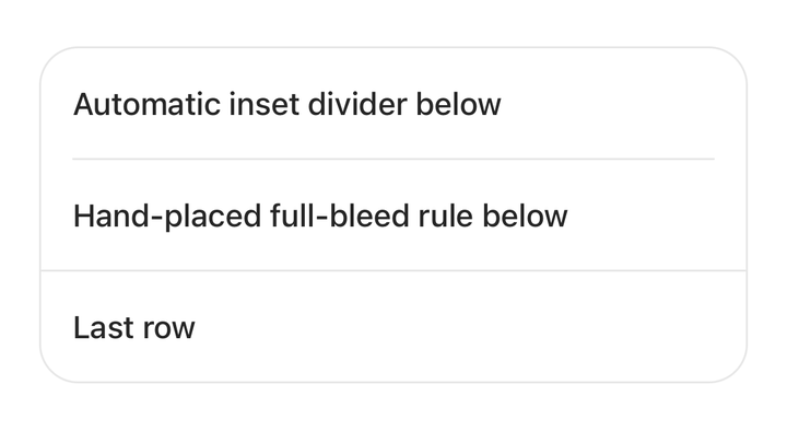
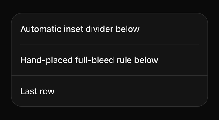
import { ListGroup } from "@delacour/native-ui/list-group";import { Separator } from "@delacour/native-ui/separator";import type { ReactElement } from "react";export function Demo(): ReactElement { return ( <ListGroup> <ListGroup.Item>Automatic inset divider below</ListGroup.Item> <ListGroup.Item>Hand-placed full-bleed rule below</ListGroup.Item> <Separator /> <ListGroup.Item>Last row</ListGroup.Item> </ListGroup> );}The long axis is self-stretch, never w-full / h-full. Yoga resolves a percentage length
against the parent's content box and then adds the margins on top, so an inset w-full line
starts 16pt in and runs 16pt past the far edge — a gap down one side and none down the other.
Stretching subtracts the margins instead, which is what an inset divider needs.
A filled box, not a border, so a caller insets it with a plain mx-* without fighting a
border's own box model. This is how ListGroup positions the dividers it inserts.
separatorVariants lives in separator.tsx rather than a .variants.ts sibling — the pattern C
carve-out for a single styled element with no pure resolvers. That file imports React Native, so
the tv() is not reachable from bun test; the two rules above are stated in its doc comment and
verified on a simulator.