Accordion
Sections that expand and collapse, animated from a measured height.
import { Accordion } from "@delacour/native-ui/accordion";<Accordion>
<Accordion.Item value="shipping">
<Accordion.Trigger>
<Accordion.Title>Shipping</Accordion.Title>
<Accordion.Description>Rates and delivery times</Accordion.Description>
</Accordion.Trigger>
<Accordion.Content>
<Text.Paragraph>Free over $50. Two to four working days.</Text.Paragraph>
</Accordion.Content>
</Accordion.Item>
</Accordion>Variants: default, secondary, tertiary, transparent — ListGroup's set, because an
accordion is the same kind of thing. Sizes: sm, md, lg.
Anatomy
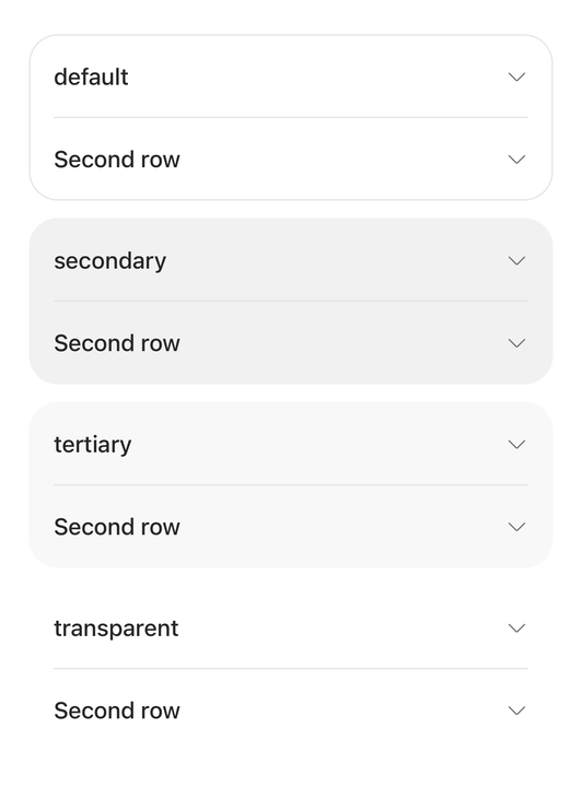
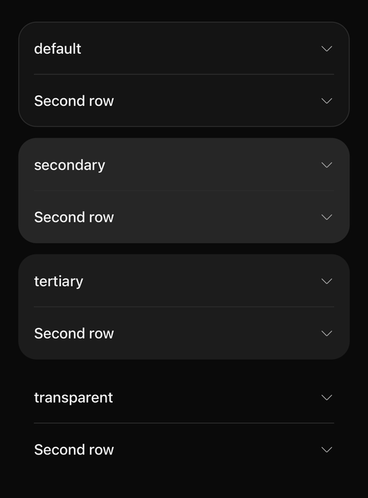
import { ACCORDION_VARIANTS, Accordion } from "@delacour/native-ui/accordion";import { Text } from "@delacour/native-ui/text";import type { ReactElement } from "react";import { View } from "react-native";export function Demo(): ReactElement { return ( <View className="gap-3"> {ACCORDION_VARIANTS.map((variant) => ( <Accordion key={variant} variant={variant}> <Accordion.Item value="one"> <Accordion.Trigger testID={`variant-${variant}`}> <Accordion.Title>{variant}</Accordion.Title> </Accordion.Trigger> <Accordion.Content> <Text.Paragraph>The surface is the root's. Everything inside it is unchanged.</Text.Paragraph> </Accordion.Content> </Accordion.Item> <Accordion.Item value="two"> <Accordion.Trigger>Second row</Accordion.Trigger> <Accordion.Content> <Text.Paragraph>So the divider between them is visible too.</Text.Paragraph> </Accordion.Content> </Accordion.Item> </Accordion> ))} </View> );}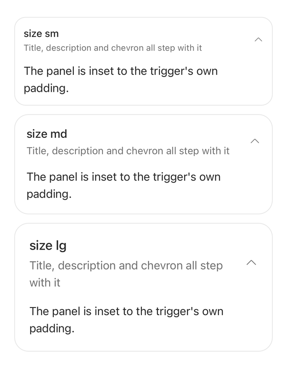
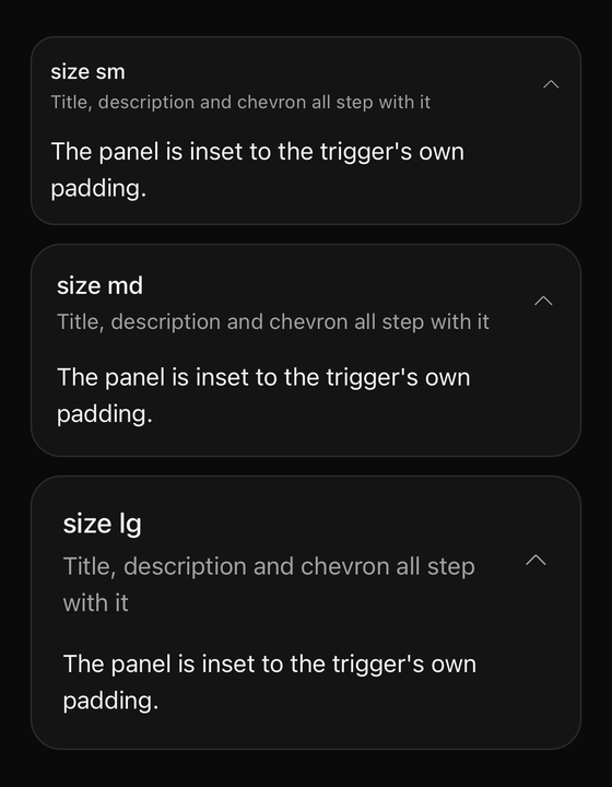
import { ACCORDION_SIZES, Accordion } from "@delacour/native-ui/accordion";import { Text } from "@delacour/native-ui/text";import type { ReactElement } from "react";import { View } from "react-native";export function Demo(): ReactElement { return ( <View className="gap-3"> {ACCORDION_SIZES.map((size) => ( <Accordion defaultValue="one" key={size} size={size}> <Accordion.Item value="one"> <Accordion.Trigger testID={`size-${size}`}> <Accordion.Title>size {size}</Accordion.Title> <Accordion.Description>Title, description and chevron all step with it</Accordion.Description> </Accordion.Trigger> <Accordion.Content> <Text.Paragraph>The panel is inset to the trigger's own padding.</Text.Paragraph> </Accordion.Content> </Accordion.Item> </Accordion> ))} </View> );}| Part | What it is |
|---|---|
Accordion | The surface. Owns the selection mode and the shared axes |
Accordion.Item | One section: a trigger, and the panel it discloses |
Accordion.Trigger | The row that opens the item. A Pressable, so it inherits the whole vocabulary |
Accordion.Title | The trigger's primary line. Bare string children become one automatically |
Accordion.Description | The trigger's secondary line, stacked under the title |
Accordion.Indicator | The glyph that turns as the panel opens. Composed in when a trigger holds none |
Accordion.Content | The measured, clipped panel. Mounts on first expand and stays mounted |
Dividers between adjacent items are inserted for you, the way ListGroup does it. A Separator
placed by hand is never doubled; isDivided={false} turns the feature off.
Selection
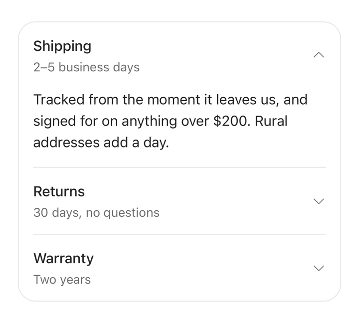
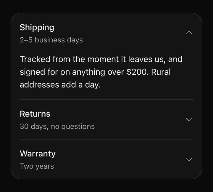
import { Accordion } from "@delacour/native-ui/accordion";import { Text } from "@delacour/native-ui/text";import type { ReactElement } from "react";const FAQ = [ { key: "shipping", title: "Shipping", description: "2–5 business days", body: "Tracked from the moment it leaves us, and signed for on anything over $200. Rural addresses add a day.", }, { key: "returns", title: "Returns", description: "30 days, no questions", body: "Send it back in any condition within thirty days. We pay the return postage and refund to the original card.", }, { key: "warranty", title: "Warranty", description: "Two years", body: "Covers manufacturing faults for two years from delivery. Wear, water and the dog are not manufacturing faults.", },] as const;export function Demo(): ReactElement { return ( <Accordion defaultValue="shipping"> {FAQ.map((entry) => ( <Accordion.Item key={entry.key} value={entry.key}> <Accordion.Trigger testID={`faq-${entry.key}`}> <Accordion.Title>{entry.title}</Accordion.Title> <Accordion.Description>{entry.description}</Accordion.Description> </Accordion.Trigger> <Accordion.Content> <Text.Paragraph>{entry.body}</Text.Paragraph> </Accordion.Content> </Accordion.Item> ))} </Accordion> );}The root is a discriminated union on selectionMode.
<Accordion value={open} onValueChange={setOpen}>…</Accordion>

<Accordion selectionMode="multiple" value={open} onValueChange={setOpen}>…</Accordion>
In single mode the value is string | null — null is a controlled empty, not an absence. In
multiple mode it is string[].
isCollapsible bounds the set, never a single item
With isCollapsible={false} the last open item is refused. In multiple mode an item still
closes while another is open. Reading it as "no item may ever close" would make a multiple
accordion add-only.
A refused tap returns its own input by identity, so it neither re-renders nor reports an
onValueChange for a change that did not happen.
The animation
The panel's height, the panel's opacity and the indicator's rotation all read one progress
shared value, so they cannot drift out of step by a frame.
The spring is critically damped: an overshoot would draw the panel taller than its content measured, flashing the surface behind it for a frame at the end of every expand.
The fade runs ahead of the height (ACCORDION_CONTENT_FADE). A panel whose opacity tracked its
height linearly would be half transparent at the midpoint of every expand, which reads as content
struggling to arrive rather than as a panel opening.
ACCORDION_UNMEASURED is negative, and that is load-bearing. A panel that measured 0 is a
real answer — a panel whose content rendered nothing — and treating it as "still waiting" would
leave the indicator stuck pointing the wrong way. Only a value no layout can produce can mean
unmeasured.
Custom indicators
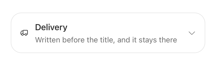
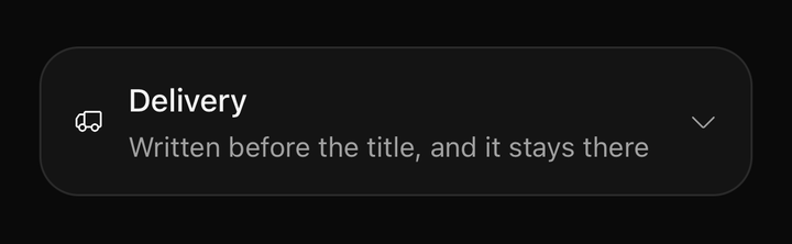
import { Accordion } from "@delacour/native-ui/accordion";import { Icon } from "@delacour/native-ui/icon";import { IconTruck } from "@delacour/native-ui/icons/central";import { Text } from "@delacour/native-ui/text";import type { ReactElement } from "react";export function Demo(): ReactElement { return ( <Accordion> <Accordion.Item value="one"> <Accordion.Trigger testID="delivery"> <Icon icon={IconTruck} /> <Accordion.Title>Delivery</Accordion.Title> <Accordion.Description>Written before the title, and it stays there</Accordion.Description> </Accordion.Trigger> <Accordion.Content> <Text.Paragraph> Tracked from the moment it leaves us, and signed for on anything over $200. Rural addresses add a day. </Text.Paragraph> </Accordion.Content> </Accordion.Item> </Accordion> );}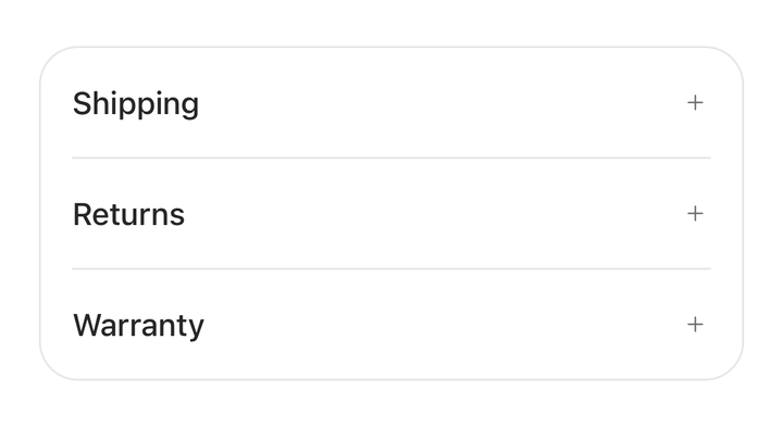
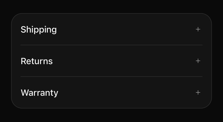
import { Accordion } from "@delacour/native-ui/accordion";import { Icon } from "@delacour/native-ui/icon";import { IconMinusSmall, IconPlusSmall } from "@delacour/native-ui/icons/central";import { Text } from "@delacour/native-ui/text";import type { ReactElement } from "react";const FAQ = [ { key: "shipping", title: "Shipping", body: "Tracked from the moment it leaves us, and signed for on anything over $200. Rural addresses add a day.", }, { key: "returns", title: "Returns", body: "Send it back in any condition within thirty days. We pay the return postage and refund to the original card.", }, { key: "warranty", title: "Warranty", body: "Covers manufacturing faults for two years from delivery. Wear, water and the dog are not manufacturing faults.", },] as const;export function Demo(): ReactElement { return ( <Accordion> {FAQ.map((entry) => ( <Accordion.Item key={entry.key} value={entry.key}> <Accordion.Trigger testID={`swap-${entry.key}`}> <Accordion.Title>{entry.title}</Accordion.Title> <Accordion.Indicator isAnimated={false}> {({ isExpanded }) => <Icon icon={isExpanded ? IconMinusSmall : IconPlusSmall} />} </Accordion.Indicator> </Accordion.Trigger> <Accordion.Content> <Text.Paragraph>{entry.body}</Text.Paragraph> </Accordion.Content> </Accordion.Item> ))} </Accordion> );}An indicator has to be a direct Accordion.Indicator child of the trigger — the trigger finds
it by element type, so a wrapped one is invisible and a second default gets composed in beside it.
Use its render function to swap the glyph on state, and isAnimated={false} to opt out of the
rotation when the glyph itself carries the change (a plus becoming a minus).
<Accordion.Trigger>
  <Accordion.Title>Details</Accordion.Title>
  <Accordion.Indicator isAnimated={false}>
    {({ isExpanded }) => <Icon icon={isExpanded ? IconMinus : IconPlus} />}
  </Accordion.Indicator>
</Accordion.Trigger>
The disabled fade lands on the item, never on the trigger. The trigger is a Pressable whose
Animated.View writes opacity every frame, so a class there is silently overwritten.
An item is expected to hold an Accordion.Content. One without a panel has nothing to measure, so
its indicator stays put.
API
Prop
Type