Field
A form field's layout, and the one place its state is written down.
import { Field } from "@delacour/native-ui/field";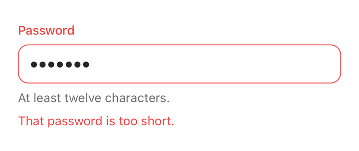
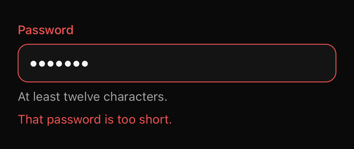
import { Field } from "@delacour/native-ui/field";import { Input } from "@delacour/native-ui/input";import type { ReactElement } from "react";export function Demo(): ReactElement { return ( <Field isInvalid> <Field.Label>Password</Field.Label> <Input defaultValue="hunter2" secureTextEntry /> <Field.Description>At least twelve characters.</Field.Description> <Field.Error>That password is too short.</Field.Error> </Field> );}<Field>
<Field.Label>Email</Field.Label>
<Input value={email} onChangeText={setEmail} />
<Field.Description>We only use this to send receipts.</Field.Description>
</Field>The state cascade
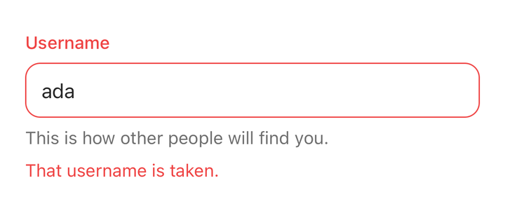
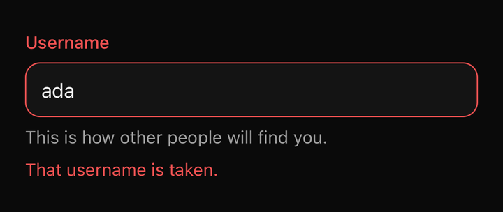
import { Field } from "@delacour/native-ui/field";import { Input } from "@delacour/native-ui/input";import type { ReactElement } from "react";export function Demo(): ReactElement { return ( <Field isInvalid> <Field.Label>Username</Field.Label> <Input defaultValue="ada" /> <Field.Description>This is how other people will find you.</Field.Description> <Field.Error>That username is taken.</Field.Error> </Field> );}isInvalid and isDisabled live on the Field and reach the control inside it.
<Field isInvalid>
  <Field.Label>Email</Field.Label>
  <Input value={email} onChangeText={setEmail} />
  <Field.Error>{error}</Field.Error>
</Field>
The label turns danger, and so does the Input — with nothing said on the input itself. A control
opts out explicitly: <Input isInvalid={false} />.
Why this is a context and not a selector
On the web, shadcn does this with group-data-[invalid=true]/field: — a parent-scoped selector.
Uniwind has no equivalent: its compiler reads data-* off a single flat selector, and its
runtime matches them against props on the component carrying the class. So no class on a
Field can reach the Input inside it. There is no group-*, no peer-*, no :has().
A data-attribute class would also leave bun test behind. Even for a part styling itself,
data-invalid:text-danger moves the decision into Uniwind's runtime matcher where no unit test
can see it. The parts style themselves from tv() booleans; the context is only for crossing a
component boundary.
The whole row drives the control
Once a control inside offers a press, the field becomes a Pressable with feedback="none" and
the whole row calls it.
<Field orientation="horizontal">
  <Field.Content>
    <Field.Label>Accept the terms</Field.Label>
    <Field.Description>You can withdraw consent at any time.</Field.Description>
  </Field.Content>
  <Checkbox checked={accepted} onCheckedChange={setAccepted} />
</Field>
Tapping the label — or the description under it — ticks the checkbox. A checkbox in a form is a small square next to a sentence, and the sentence is what people aim at.
A field of static text registers nothing and stays a View. Mounting a gesture detector regardless
would put one under every label in a form. The row is accessible={false} so the control stays
the element a screen reader sees, and the inner detector claims a tap on the box itself rather
than firing both.
Orientation
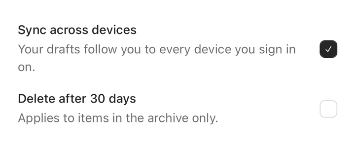
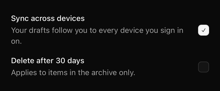
import { Checkbox } from "@delacour/native-ui/checkbox";import { Field } from "@delacour/native-ui/field";import type { ReactElement } from "react";import { View } from "react-native";export function Demo(): ReactElement { return ( <View className="gap-4"> <Field orientation="horizontal"> <Field.Content> <Field.Label>Sync across devices</Field.Label> <Field.Description>Your drafts follow you to every device you sign in on.</Field.Description> </Field.Content> <Checkbox color="primary" defaultChecked testID="sync" /> </Field> <Field orientation="horizontal"> <Field.Content> <Field.Label>Delete after 30 days</Field.Label> <Field.Description>Applies to items in the archive only.</Field.Description> </Field.Content> <Checkbox color="primary" testID="delete-after-30-days" /> </Field> </View> );}<Field orientation="vertical">…</Field>
<Field orientation="horizontal">…</Field>vertical stacks the label over the control. horizontal puts them side by side — use
Field.Content to group the label with its description as one block.
Sets and groups
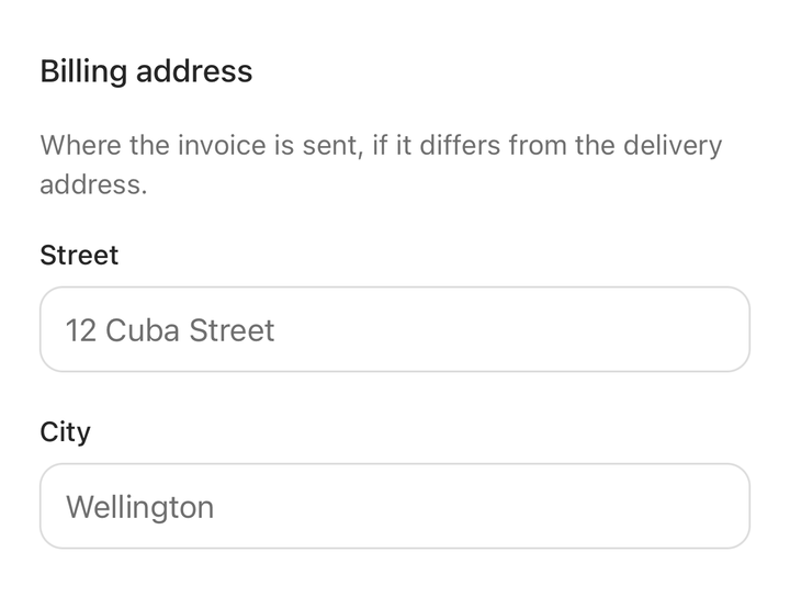
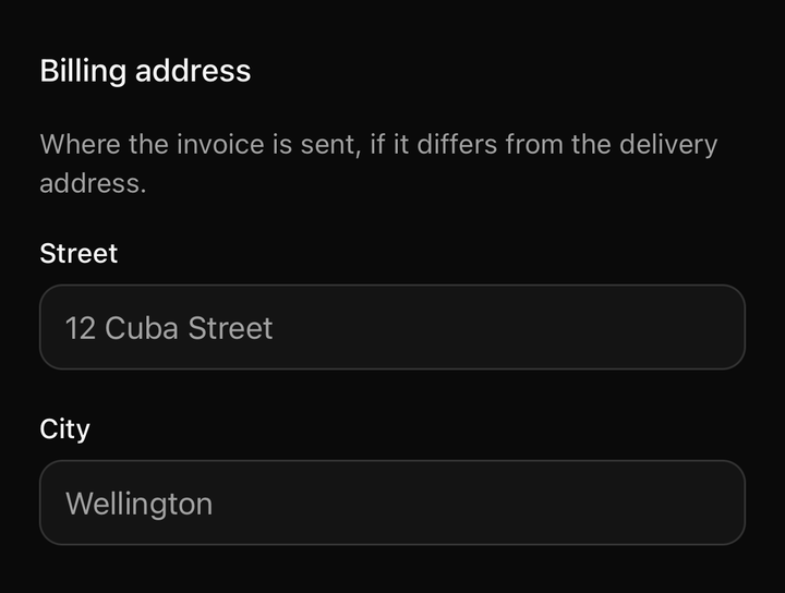
import { Field } from "@delacour/native-ui/field";import { Input } from "@delacour/native-ui/input";import type { ReactElement } from "react";export function Demo(): ReactElement { return ( <Field.Set> <Field.Legend>Billing address</Field.Legend> <Field.Description>Where the invoice is sent, if it differs from the delivery address.</Field.Description> <Field.Group> <Field> <Field.Label>Street</Field.Label> <Input placeholder="12 Cuba Street" /> </Field> <Field> <Field.Label>City</Field.Label> <Input placeholder="Wellington" /> </Field> </Field.Group> </Field.Set> );}<Field.Set>
<Field.Legend>Notifications</Field.Legend>
<Field.Description>Choose what reaches you, and how.</Field.Description>
<Field.Group>
<Field orientation="horizontal">
<Field.Label>Email</Field.Label>
<Checkbox checked={email} onCheckedChange={setEmail} />
</Field>
<Field orientation="horizontal">
<Field.Label>Push</Field.Label>
<Checkbox checked={push} onCheckedChange={setPush} />
</Field>
</Field.Group>
</Field.Set>Field.Legend takes variant="label" for a nested set, so it matches the fields under it rather
than titling them.
The gap ladder is the component
content 0.5 → root 1.5 → set 4 → group 5. A label attaches to the control beneath it
rather than the one above purely because the gap inside a field is tighter than the gap between
two, and nothing else is doing that work. The test pins the ordering, not the numbers.
Field.Group inserts no dividers, unlike ListGroup. A list of rows without lines is a wall of
text; fields are already held apart by whitespace, and a rule between every one is noise.
A set holds no state. isInvalid and isDisabled live on each Field, because a whole
section turning danger says less than the one field that is actually wrong.
Separators
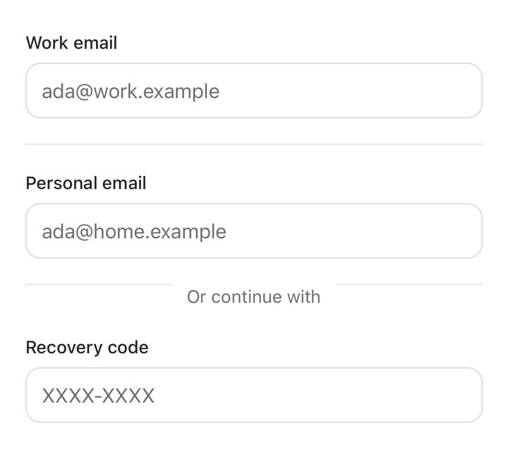
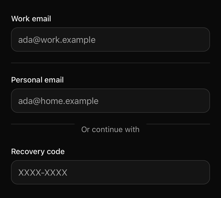
import { Field } from "@delacour/native-ui/field";import { Input } from "@delacour/native-ui/input";import type { ReactElement } from "react";export function Demo(): ReactElement { return ( <Field.Group> <Field> <Field.Label>Work email</Field.Label> <Input inputMode="email" placeholder="ada@work.example" /> </Field> <Field.Separator /> <Field> <Field.Label>Personal email</Field.Label> <Input inputMode="email" placeholder="ada@home.example" /> </Field> <Field.Separator>Or continue with</Field.Separator> <Field> <Field.Label>Recovery code</Field.Label> <Input autoCapitalize="characters" placeholder="XXXX-XXXX" /> </Field> </Field.Group> );}<Field.Separator />
<Field.Separator>or</Field.Separator>A labelled separator draws two rules with the label between them, not one rule with the label
on top. The web version absolutely-positions a single rule and punches a hole in it with an opaque
bg-background label — invisible only while the separator sits on exactly that colour. On a card
or a sheet the hole shows as a block of the wrong shade. Two rules assume nothing about what is
behind them.
Errors
<Field.Error>{error}</Field.Error>Field.Error renders nothing when it has no children, so the line removes itself once the value is
fixed.
It is deliberately not gated on isInvalid: a part that swallowed children you actually
wrote, because of a prop on a sibling, would be a part whose absence is unexplainable from the call
site.
Only the label fades when disabled. The control dims itself, and a dimmed description stacked on a
dimmed control reads as two problems rather than one state. The description stays muted when
invalid too, so an appearing Field.Error is the one line that changed.
Reading the field's state
import { useField, useFieldContext } from "@delacour/native-ui/field";

const { isInvalid, isDisabled, orientation } = useField();
useField() throws outside a <Field>. Use useFieldContext() where the field is optional — as
every control does.
Anatomy
Prop
Type
API
FieldProps
React Native's ViewProps, plus:
Prop
Type
FieldTextProps
TextProps with variant omitted — each part already is one, and naming a second would let a
caller turn a description into a heading and lose the type scale the component exists to keep.
FieldLegendProps
FieldTextProps, plus:
Prop
Type
useField()
Prop
Type
What it deliberately does not have
No Field.Title. On the web it exists because a <div> is not a <label> — label-styled text
with nothing to point htmlFor at. React Native has neither element nor association, so it and
Field.Label would render the same Text.
No errors array prop. shadcn's exists to accept react-hook-form and Standard Schema shapes,
and this package takes no form dependency.
No type scale in the slots. The text parts render the Text presets and pass a colour, never
a scale. A text-sm font-medium written into a slot here would be a second definition of
Text.Label that could drift from it — the same reason Input ships no label part at all. A test
asserts the text slots carry no size, weight or colour.
Exported constants
import {
  FIELD_ORIENTATIONS,
  FIELD_LEGEND_VARIANTS,
  FIELD_TEXT_PARTS,
  fieldVariants,
  resolveFieldTextColor,
  resolveFieldInteractive,
} from "@delacour/native-ui/field";