Icon
Central Icons, sized and coloured by inheritance.
import { Icon } from "@delacour/native-ui/icon";
import { IconHeart } from "@delacour/native-ui/icons/central";

<Icon icon={IconHeart} />;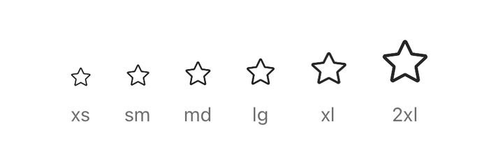
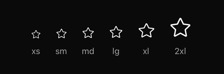
import { ICON_SIZES, Icon } from "@delacour/native-ui/icon";import { IconStar } from "@delacour/native-ui/icons/central";import { Text } from "@delacour/native-ui/text";import type { ReactElement } from "react";import { View } from "react-native";export function Demo(): ReactElement { return ( <View className="flex-row flex-wrap items-end gap-5"> {ICON_SIZES.map((size) => ( <View className="items-center gap-2" key={size}> <Icon icon={IconStar} size={size} /> <Text.Caption size="xs">{size}</Text.Caption> </View> ))} </View> );}Sizes: xs 14, sm 16, md 18, lg 20, xl 24, 2xl 32 — the shared icon scale, which
Spinner reads too.
The full guide is Icons; the precedence ladder is in Sizing.
Props
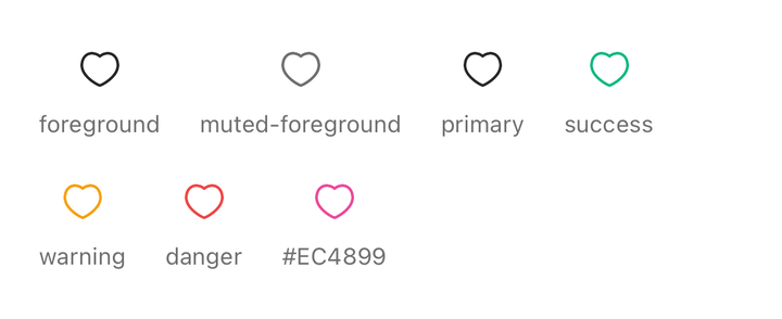
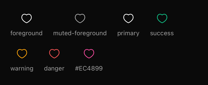
import { Icon } from "@delacour/native-ui/icon";import { IconHeart } from "@delacour/native-ui/icons/central";import { Text } from "@delacour/native-ui/text";import type { ReactElement } from "react";import { View } from "react-native";const COLORS = ["foreground", "muted-foreground", "primary", "success", "warning", "danger", "#EC4899"] as const;export function Demo(): ReactElement { return ( <View className="flex-row flex-wrap items-center gap-5"> {COLORS.map((color) => ( <View className="items-center gap-2" key={color}> <Icon color={color} icon={IconHeart} size="xl" /> <Text.Caption size="xs">{color}</Text.Caption> </View> ))} </View> );}Prop
Type
Publishing defaults
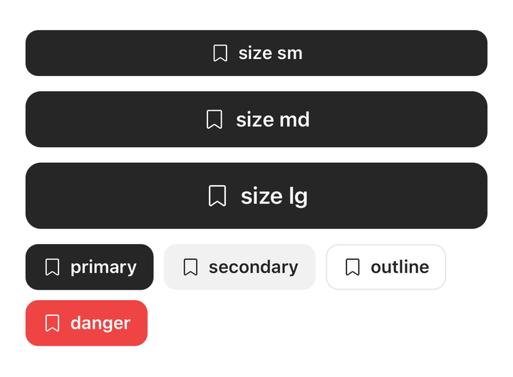
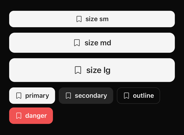
import { BUTTON_SIZES, Button } from "@delacour/native-ui/button";import { Icon } from "@delacour/native-ui/icon";import { IconBookmark } from "@delacour/native-ui/icons/central";import type { ReactElement } from "react";import { View } from "react-native";const VARIANTS = ["primary", "secondary", "outline", "danger"] as const;export function Demo(): ReactElement { return ( <View className="gap-3"> {BUTTON_SIZES.map((size) => ( <Button key={size} size={size} testID={`bookmark-${size}`}> <Icon icon={IconBookmark} /> <Button.Label>size {size}</Button.Label> </Button> ))} <View className="flex-row flex-wrap gap-2"> {VARIANTS.map((variant) => ( <Button key={variant} size="sm" variant={variant}> <Icon icon={IconBookmark} /> <Button.Label>{variant}</Button.Label> </Button> ))} </View> </View> );}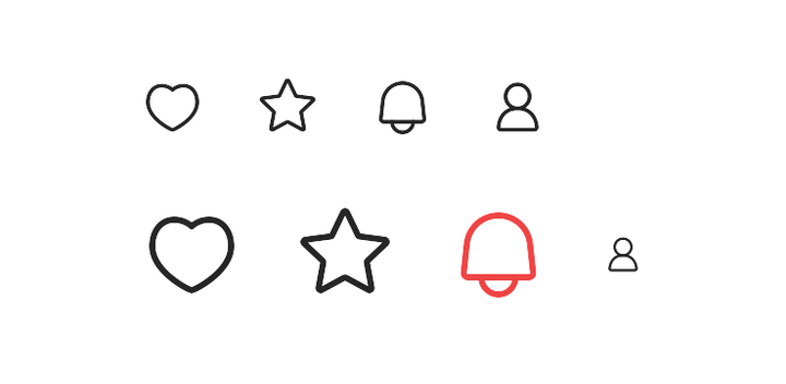
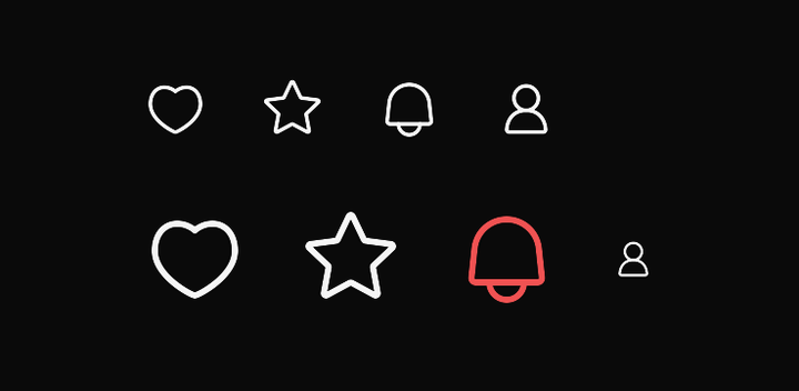
import { Icon, IconDefaultsProvider } from "@delacour/native-ui/icon";import { IconBell, IconHeart, IconStar, IconUser } from "@delacour/native-ui/icons/central";import type { ReactElement } from "react";import { View } from "react-native";export function Demo(): ReactElement { return ( <View className="gap-5"> <View className="flex-row items-center gap-4"> <Icon icon={IconHeart} /> <Icon icon={IconStar} /> <Icon icon={IconBell} /> <Icon icon={IconUser} /> </View> <IconDefaultsProvider value={{ className: "size-icon-2xl", color: "primary" }}> <View className="flex-row items-center gap-4"> <Icon icon={IconHeart} /> <Icon icon={IconStar} /> <Icon color="danger" icon={IconBell} /> <Icon icon={IconUser} size="xs" /> </View> </IconDefaultsProvider> </View> );}import { IconDefaultsProvider } from "@delacour/native-ui/icon";
<IconDefaultsProvider className="size-icon-lg" color="muted-foreground">
{children}
</IconDefaultsProvider>;Button, Badge and ListGroup.ItemPrefix all publish into this, so a bare <Icon> inside one
needs nothing at the call site.
Exports
import {
  Icon,
  type IconProps,
  type IconComponent,
  IconDefaultsProvider,
  useIconDefaults,
  ICON_SIZES,
  ICON_FALLBACK_COLOR,
  ICON_FALLBACK_SIZE_CLASS,
  iconVariants,
  isIconSize,
  resolveIconSizeClass,
} from "@delacour/native-ui/icon";