Radio
One choice from a set, with a trailing indicator row.
import { Radio } from "@delacour/native-ui/radio";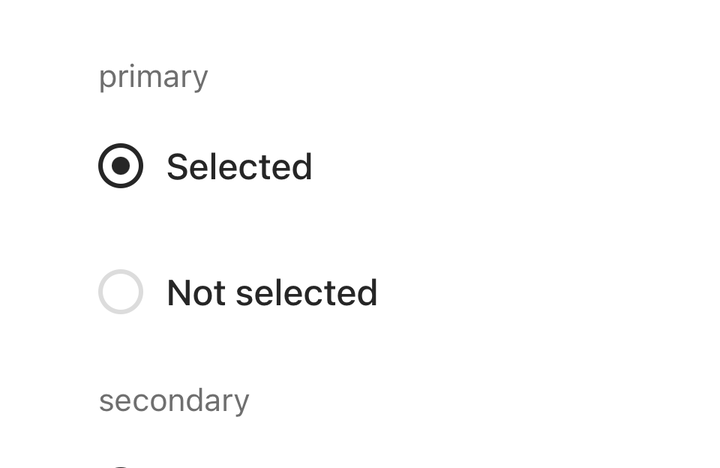
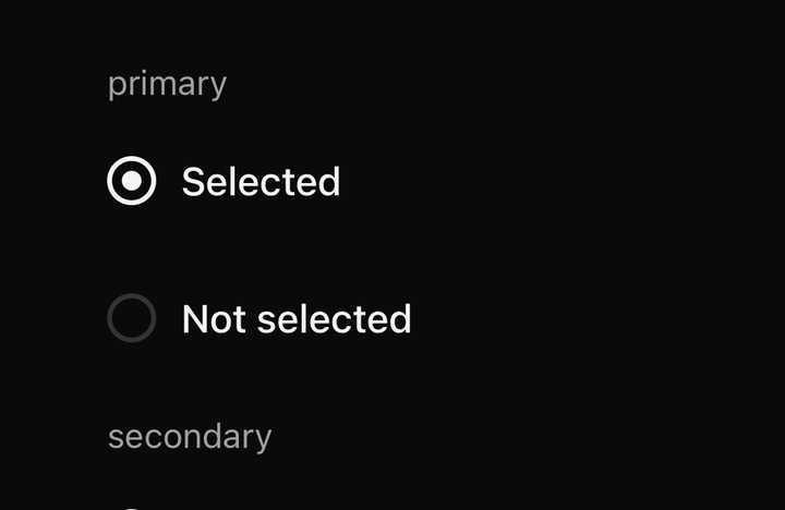
import { RADIO_VARIANTS, Radio } from "@delacour/native-ui/radio";import { Text } from "@delacour/native-ui/text";import type { ReactElement } from "react";import { View } from "react-native";export function Demo(): ReactElement { return ( <View className="gap-4"> {RADIO_VARIANTS.map((variant) => ( <View className="gap-2" key={variant}> <Text.Caption color="muted">{variant}</Text.Caption> <Radio.Group accessibilityLabel={`${variant} example`} defaultSelected="on" orientation="horizontal" variant={variant} > <Radio testID={`radio-${variant}-on`} value="on"> Selected </Radio> <Radio testID={`radio-${variant}-off`} value="off"> Not selected </Radio> </Radio.Group> </View> ))} </View> );}<Radio.Group value={plan} onValueChange={setPlan}>
<Radio value="monthly"><Radio.Label>Monthly</Radio.Label></Radio>
<Radio value="annual"><Radio.Label>Annual</Radio.Label></Radio>
</Radio.Group>Variants: primary, secondary. Sizes: sm, md, lg. Orientations: vertical,
horizontal.
Anatomy
| Part | What it is |
|---|---|
Radio | One option. A Pressable that selects its value in the enclosing group |
Radio.Label | The option's text, inside the tap target |
Radio.Indicator | The dot. Accepts custom children to replace the default glyph |
Radio.Group | Owns the selected value and the shared axes |
The row puts the indicator last — the label leads, the state trails. That is the opposite of
Checkbox, and it is deliberate: a radio group is read as a list of choices, and a column of
leading dots turns the labels into a second column.
The dot
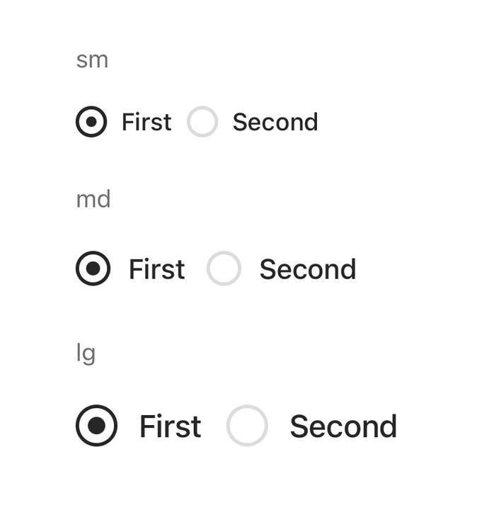
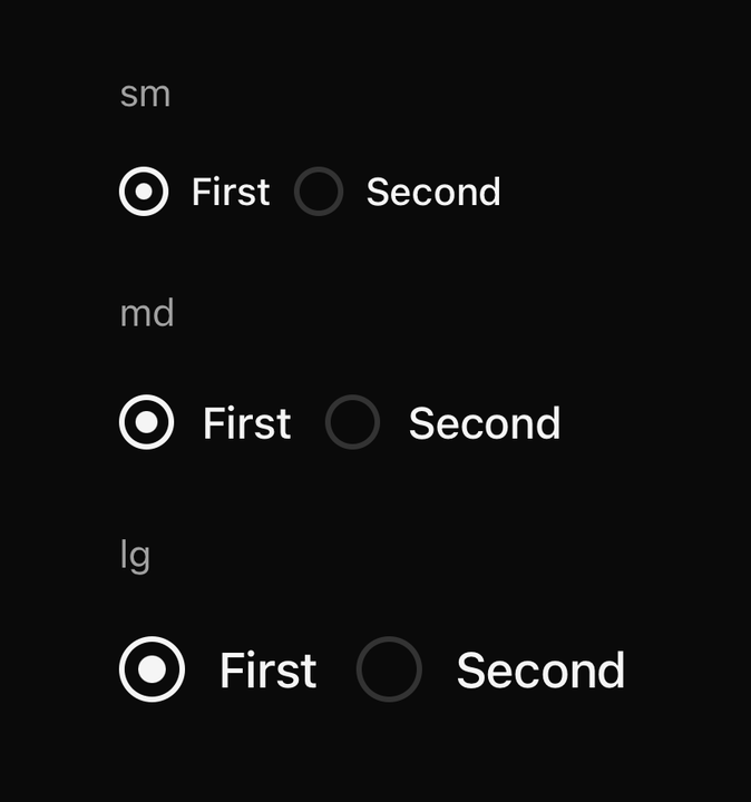
import { RADIO_SIZES, Radio } from "@delacour/native-ui/radio";import { Text } from "@delacour/native-ui/text";import type { ReactElement } from "react";import { View } from "react-native";export function Demo(): ReactElement { return ( <View className="gap-4"> {RADIO_SIZES.map((size) => ( <View className="gap-2" key={size}> <Text.Caption color="muted">{size}</Text.Caption> <Radio.Group accessibilityLabel={`Size ${size}`} defaultSelected="a" orientation="horizontal" size={size}> <Radio testID={`radio-${size}-a`} value="a"> First </Radio> <Radio testID={`radio-${size}-b`} value="b"> Second </Radio> </Radio.Group> </View> ))} </View> );}A spring, not a timing — RADIO_DOT_SPRING. A dot that eases in reads as a fade; a dot that
springs reads as a selection landing.
Groups
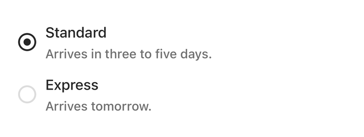
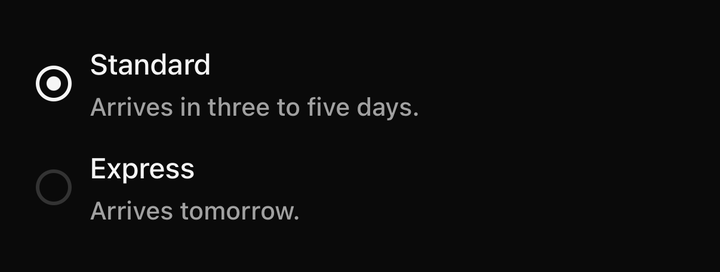
import { Radio } from "@delacour/native-ui/radio";import { Text } from "@delacour/native-ui/text";import { type ReactElement, useState } from "react";import { View } from "react-native";export function Demo(): ReactElement { const [speed, setSpeed] = useState("standard"); return ( <Radio.Group accessibilityLabel="Delivery" onSelected={setSpeed} selected={speed}> <Radio testID="radio-standard" value="standard"> <View className="min-w-0 shrink gap-0.5"> <Radio.Label>Standard</Radio.Label> <Text.Caption>Arrives in three to five days.</Text.Caption> </View> </Radio> <Radio testID="radio-express" value="express"> <View className="min-w-0 shrink gap-0.5"> <Radio.Label>Express</Radio.Label> <Text.Caption>Arrives tomorrow.</Text.Caption> </View> </Radio> </Radio.Group> );}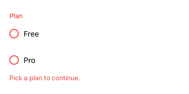
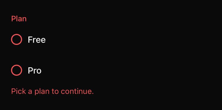
import { Field } from "@delacour/native-ui/field";import { Radio } from "@delacour/native-ui/radio";import { type ReactElement, useState } from "react";export function Demo(): ReactElement { const [fieldPlan, setFieldPlan] = useState<string>(); return ( <Field isInvalid={fieldPlan === undefined}> <Field.Label>Plan</Field.Label> <Radio.Group accessibilityLabel="Plan" onSelected={setFieldPlan} selected={fieldPlan ?? null}> <Radio testID="radio-free" value="free"> Free </Radio> <Radio testID="radio-pro" value="pro"> Pro </Radio> </Radio.Group> <Field.Error>{fieldPlan === undefined ? "Pick a plan to continue." : ""}</Field.Error> </Field> );}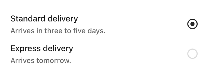
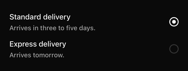
import { Radio } from "@delacour/native-ui/radio";import { Text } from "@delacour/native-ui/text";import { type ReactElement, useState } from "react";import { View } from "react-native";export function Demo(): ReactElement { const [row, setRow] = useState("standard"); return ( <Radio.Group accessibilityLabel="Delivery speed" onSelected={setRow} selected={row}> <Radio testID="radio-standard" value="standard"> <View className="min-w-0 shrink gap-0.5"> <Radio.Label>Standard delivery</Radio.Label> <Text.Caption>Arrives in three to five days.</Text.Caption> </View> <Radio.Indicator /> </Radio> <Radio testID="radio-express" value="express"> <View className="min-w-0 shrink gap-0.5"> <Radio.Label>Express delivery</Radio.Label> <Text.Caption>Arrives tomorrow.</Text.Caption> </View> <Radio.Indicator /> </Radio> </Radio.Group> );}The group owns the selected value; a Radio inside one takes no checked prop. Precedence follows
Checkbox.Group's ladder — own ?? group ?? field ?? default — for the shared axes.
import { useRadio, useRadioGroup } from "@delacour/native-ui/radio";Exports
import {
  Radio,
  type RadioProps,
  RADIO_VARIANTS,
  RADIO_SIZES,
  RADIO_ORIENTATIONS,
  RADIO_DOT_SPRING,
  RADIO_DEFAULT_SIZE,
  RADIO_DEFAULT_VARIANT,
  RADIO_LABEL_TEXT_SIZE,
} from "@delacour/native-ui/radio";
API
A radio is a Pressable, so feedback, haptic and the rest are inherited — see
Pressable.
Prop
Type
Radio.Group
Owns which radio is selected. Extends ViewProps.
Prop
Type
Radio.Indicator
The dot. Composed in when a radio holds none of its own; write it out to restyle it or to replace the glyph entirely.
Prop
Type
Radio.Label
The radio's text, wired as its accessible name. Extends React Native's TextProps.
Prop
Type