Button
A pressable action, with composed icons and a loading state that costs no layout.
import { Button } from "@delacour/native-ui/button";<Button onPress={save}>Save</Button>A string child is wrapped in a Button.Label automatically. React Native crashes on bare text
outside a <Text>, so every component here that takes free-form children does the same.
Variants
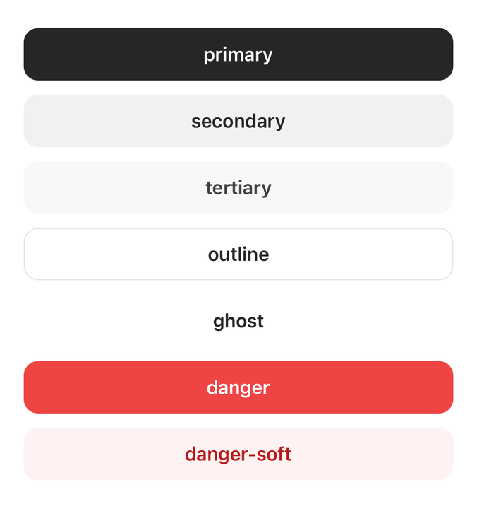
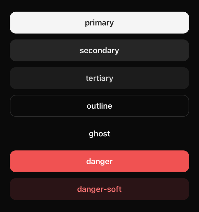
import { BUTTON_VARIANTS, Button } from "@delacour/native-ui/button";import type { ReactElement } from "react";import { View } from "react-native";export function Demo(): ReactElement { return ( <View className="gap-3"> {BUTTON_VARIANTS.map((variant) => ( <Button key={variant} testID={`variant-${variant}`} variant={variant}> {variant} </Button> ))} </View> );}<Button variant="primary">Continue</Button>The strongest action on the screen. One per view.
Sizes
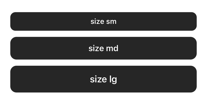
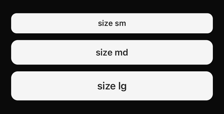
import { BUTTON_SIZES, Button } from "@delacour/native-ui/button";import type { ReactElement } from "react";import { View } from "react-native";export function Demo(): ReactElement { return ( <View className="gap-3"> {BUTTON_SIZES.map((size) => ( <Button key={size} size={size} testID={`size-${size}`}> size {size} </Button> ))} </View> );}<Button size="sm">Small</Button>
<Button size="md">Medium</Button>
<Button size="lg">Large</Button>A size is one axis driving four values: the height (--spacing-button-*), the label's type scale
(--text-button-*), the icon step (--spacing-icon-*) and the horizontal padding.
Icons
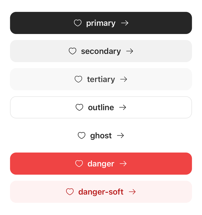
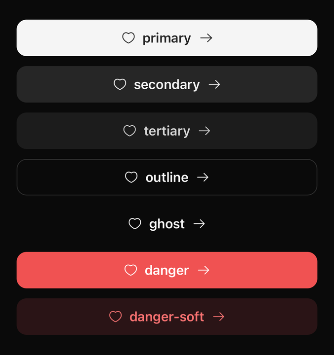
import { BUTTON_VARIANTS, Button } from "@delacour/native-ui/button";import { Icon } from "@delacour/native-ui/icon";import { IconArrowRight, IconHeart } from "@delacour/native-ui/icons/central";import type { ReactElement } from "react";import { View } from "react-native";export function Demo(): ReactElement { return ( <View className="gap-3"> {BUTTON_VARIANTS.map((variant) => ( <Button key={variant} testID={`both-${variant}`} variant={variant}> <Icon icon={IconHeart} /> <Button.Label>{variant}</Button.Label> <Icon icon={IconArrowRight} /> </Button> ))} </View> );}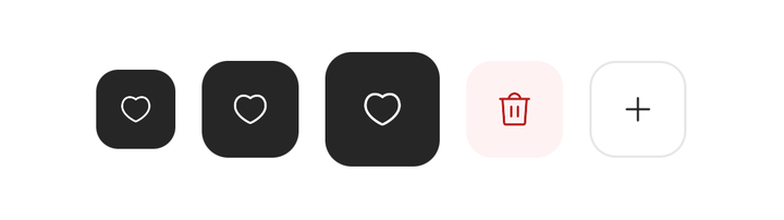
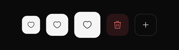
import { BUTTON_SIZES, Button } from "@delacour/native-ui/button";import { Icon } from "@delacour/native-ui/icon";import { IconHeart, IconPlusMedium, IconTrashCan } from "@delacour/native-ui/icons/central";import type { ReactElement } from "react";import { View } from "react-native";export function Demo(): ReactElement { return ( <View className="flex-row items-center gap-3"> {BUTTON_SIZES.map((size) => ( <Button accessibilityLabel={`Favourite ${size}`} isIconOnly key={size} size={size} testID={`favourite-${size}`}> <Icon icon={IconHeart} /> </Button> ))} <Button accessibilityLabel="Delete" isIconOnly testID="delete" variant="danger-soft"> <Icon icon={IconTrashCan} /> </Button> <Button accessibilityLabel="Add" isIconOnly testID="add" variant="outline"> <Icon icon={IconPlusMedium} /> </Button> </View> );}Icons are composed, never passed as props. Put an Icon in the children, before or after the
label.
import { Icon } from "@delacour/native-ui/icon";
import { IconArrowRight, IconTrash } from "@delacour/native-ui/icons/central";

<Button onPress={next}>
  <Button.Label>Continue</Button.Label>
  <Icon icon={IconArrowRight} />
</Button>

<Button variant="danger" onPress={remove}>
  <Icon icon={IconTrash} />
  <Button.Label>Delete</Button.Label>
</Button>
The button wraps its subtree in an IconDefaultsProvider carrying the size and the variant's
foreground token, so a bare <Icon> comes out right with nothing said at the call site. An
explicit size or color on the icon still wins.
Button.StartContent and Button.EndContent are for wrapping leading or trailing content that is
not an Icon.
Icon-only
<Button isIconOnly accessibilityLabel="Favourite" variant="ghost">
  <Icon icon={IconHeart} />
</Button>
Always pair isIconOnly with an accessibilityLabel. There is no text for a screen reader to
fall back on.
Loading
<Button isLoading onPress={save}>Save</Button>isLoading composes a Spinner in and blocks presses.
The spinner replaces the icon, it does not join it. It takes the place of the composed Icon
on the side spinnerPlacement names — the first at start, the last at end — so the label does
not shift when work begins and shift back when it ends. The swap costs no layout because both
glyphs are drawn at the button's own size-icon-* token. Only a bare Icon is swapped; a
Button.StartContent wraps content of unknown height, and replacing one could resize the button.
Placement
<Button isLoading spinnerPlacement="start">Save</Button>
<Button isLoading spinnerPlacement="end">Save</Button>
<Button isLoading spinnerPlacement="only">Save</Button>
only drops the children and centres the spinner in the footprint the button already has,
carrying the label onto accessibilityLabel so a screen reader still has a name to read. It does
not square the button on its own — pair it with isIconOnly when a square is what you want.
Loading is not disabled
isLoading blocks the press and announces the button as busy, but keeps full contrast. The
spinner already says the press landed, and dimming reads as "this control is unavailable". Pass
isDimmedWhileLoading to opt into the faded treatment.
Width in a content-width container
A stretched button keeps its width while loading, because only keeps its footprint. Inside a
flex-row it still shrinks to the spinner, and that snap is un-animated on purpose: Pressable's
Animated.View already runs a useAnimatedStyle on opacity and transform, and a native
layout transition on the same view fights it for prop ownership. Pin the width (w-full,
min-w-*) if you need it stable.
Press feedback and haptics
A button is a Pressable. feedback, haptic, pressedScale and the rest are inherited
rather than restated; only the default differs — scale.
<Button feedback="fade">Fade on press</Button>
<Button haptic="selection">With haptic</Button>
<Button pressedScale={0.92}>Deeper press</Button>
Do not add ripple, ink, glow or highlight overlays. There are no wash layers on pressables in this library.
Reading the button's state
import { useButton } from "@delacour/native-ui/button";

function ButtonCount({ count }: { count: number }) {
  const { variant, size, isDisabled } = useButton();
  // …
}
Anatomy
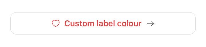
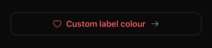
import { Button } from "@delacour/native-ui/button";import { Icon } from "@delacour/native-ui/icon";import { IconArrowRight, IconHeart } from "@delacour/native-ui/icons/central";import type { ReactElement } from "react";export function Demo(): ReactElement { return ( <Button testID="compound" variant="outline"> <Button.StartContent> <Icon color="danger" icon={IconHeart} size={18} /> </Button.StartContent> <Button.Label className="text-danger">Custom label colour</Button.Label> <Button.EndContent> <Icon color="muted-foreground" icon={IconArrowRight} size={18} /> </Button.EndContent> </Button> );}Prop
Type
API
ButtonProps
Extends PressableProps, minus busy, children, disabled, pressedOpacity and
pressedScale.
Prop
Type
ButtonLabelProps
React Native's TextProps, plus className.
useButton()
Prop
Type
Exported constants
import {
  BUTTON_VARIANTS,
  BUTTON_SIZES,
  BUTTON_SPINNER_PLACEMENTS,
  BUTTON_FOREGROUND_TOKEN,
  buttonVariants,
} from "@delacour/native-ui/button";
BUTTON_FOREGROUND_TOKEN maps each variant to the theme token its icons and text are drawn in.
buttonVariants is the tv() slot set — useful when building a component that has to match a
button exactly.