Input
A text field, and the box that can hold content beside it.
import { Input } from "@delacour/native-ui/input";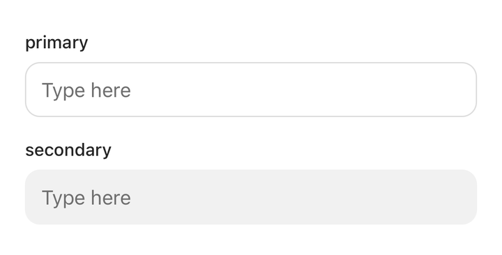
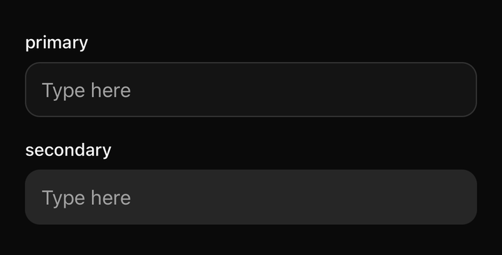
import { Field } from "@delacour/native-ui/field";import { INPUT_VARIANTS, Input } from "@delacour/native-ui/input";import { type ReactElement, useState } from "react";import { View } from "react-native";export function Demo(): ReactElement { const [value, setValue] = useState(""); return ( <View className="gap-4"> {INPUT_VARIANTS.map((variant) => ( <Field key={variant}> <Field.Label>{variant}</Field.Label> <Input onChangeText={setValue} placeholder="Type here" testID={`input-${variant}`} value={value} variant={variant} /> </Field> ))} </View> );}<Input value={email} onChangeText={setEmail} placeholder="you@example.com" />Variants: primary, secondary. Sizes: sm, md, lg — the box height, the value's
type scale and a decorator's icon step, on one axis.
Groups
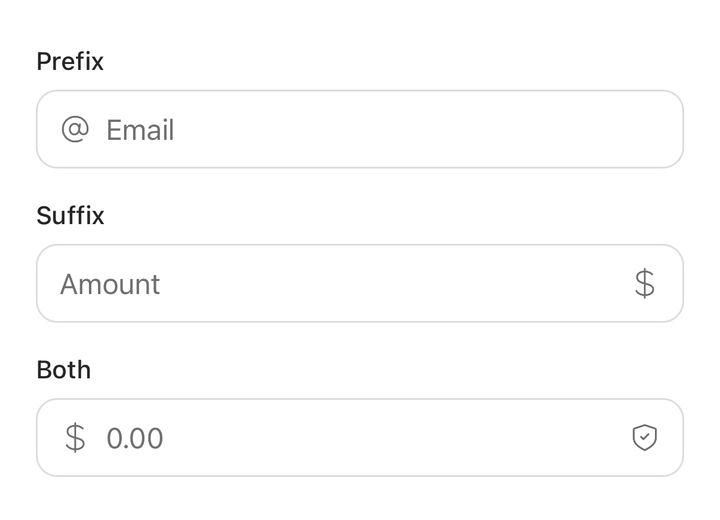
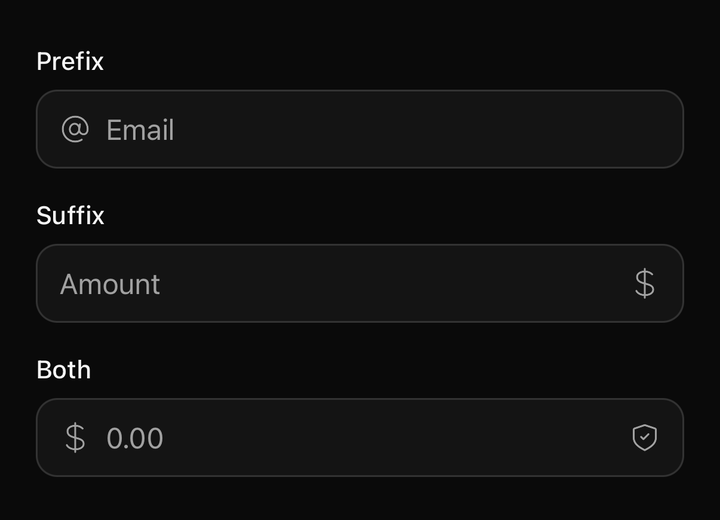
import { Field } from "@delacour/native-ui/field";import { Icon } from "@delacour/native-ui/icon";import { IconAt, IconCurrencyDollar, IconShieldCheck } from "@delacour/native-ui/icons/central";import { Input } from "@delacour/native-ui/input";import type { ReactElement } from "react";import { View } from "react-native";export function Demo(): ReactElement { return ( <View className="gap-4"> <Field> <Field.Label>Prefix</Field.Label> <Input.Group> <Input.Group.Prefix> <Icon icon={IconAt} /> </Input.Group.Prefix> <Input autoCapitalize="none" inputMode="email" placeholder="Email" /> </Input.Group> </Field> <Field> <Field.Label>Suffix</Field.Label> <Input.Group> <Input placeholder="Amount" inputMode="decimal" /> <Input.Group.Suffix> <Icon icon={IconCurrencyDollar} /> </Input.Group.Suffix> </Input.Group> </Field> <Field> <Field.Label>Both</Field.Label> <Input.Group> <Input.Group.Prefix> <Icon icon={IconCurrencyDollar} /> </Input.Group.Prefix> <Input inputMode="decimal" placeholder="0.00" /> <Input.Group.Suffix> <Icon icon={IconShieldCheck} /> </Input.Group.Suffix> </Input.Group> </Field> </View> );}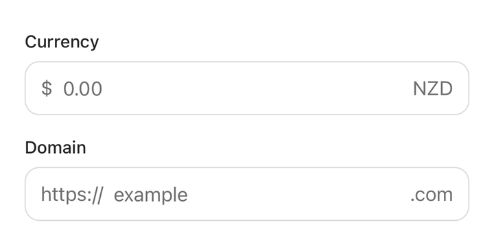
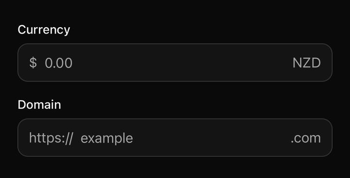
import { Field } from "@delacour/native-ui/field";import { Input } from "@delacour/native-ui/input";import type { ReactElement } from "react";import { View } from "react-native";export function Demo(): ReactElement { return ( <View className="gap-4"> <Field> <Field.Label>Currency</Field.Label> <Input.Group> <Input.Group.Prefix>$</Input.Group.Prefix> <Input inputMode="decimal" placeholder="0.00" /> <Input.Group.Suffix>NZD</Input.Group.Suffix> </Input.Group> </Field> <Field> <Field.Label>Domain</Field.Label> <Input.Group> <Input.Group.Prefix>https://</Input.Group.Prefix> <Input autoCapitalize="none" placeholder="example" /> <Input.Group.Suffix>.com</Input.Group.Suffix> </Input.Group> </Field> </View> );}<Input.Group>
<Input.Group.Prefix>$</Input.Group.Prefix>
<Input value={amount} onChangeText={setAmount} keyboardType="decimal-pad" />
<Input.Group.Suffix>NZD</Input.Group.Suffix>
</Input.Group>The box is one slot with two homes, and that is the whole design. The root slot lands on the
TextInput when a field stands alone and on Input.Group's row when it does not. A grouped field
is therefore the same box rather than a similar one — the test sweeps the entire matrix and
asserts every chrome utility a lone field wears is present on the group's row.
Do not give Input.Group a border, background or height of its own. A second class string is a
second thing that can drift, and the drift would be a one-pixel difference nobody notices until it
is shipped.
The group owns the axes, because it owns the box. variant, size, isInvalid and
isDisabled live on Input.Group, and an Input inside one reads them from context.
Pressing the group focuses the field: a lone field is its own tap target edge to edge, but a
grouped one only covers the middle of the box. A Button inside a decorator still receives its own
press.
Prefix and suffix share one decorator slot and one implementation — they are the same box in
different places, and the row's gap is what separates them.
State precedence
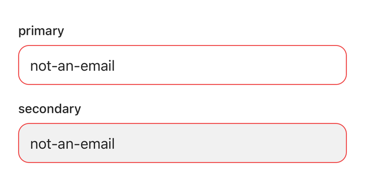
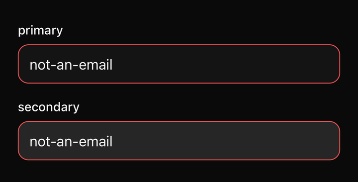
import { Field } from "@delacour/native-ui/field";import { INPUT_VARIANTS, Input } from "@delacour/native-ui/input";import type { ReactElement } from "react";import { View } from "react-native";export function Demo(): ReactElement { return ( <View className="gap-4"> {INPUT_VARIANTS.map((variant) => ( <Field key={variant}> <Field.Label>{variant}</Field.Label> <Input defaultValue="not-an-email" isInvalid testID={`invalid-${variant}`} variant={variant} /> </Field> ))} </View> );}Input.Group → the Input's own prop → the enclosing Field. Both are ?? chains, so an
explicit false is a value rather than an absence.
Invalid outranks focus. A field that went grey the moment it was tapped would drop the only signal it has that its value is wrong, exactly while the value is being corrected.
Placeholder, caret and selection colours
These take a colour value, not a style. Uniwind's own TextInput accepts a className for each
and compiles it to styles.accentColor — so this component wraps nothing in withUniwind.
They must be accent-* utilities
accent-muted-foreground, never text-muted-foreground. Uniwind reads only accentColor off the
compiled class, so anything else resolves to nothing: it warns once in development and leaves the
prop undefined, which renders as the platform default rather than as an error.
placeholderTextColorClassName is Omited from InputProps — Uniwind's name and ours would
otherwise both reach the same colour. selectionColorClassName keeps Uniwind's name; only its
default is supplied here.
Multiline
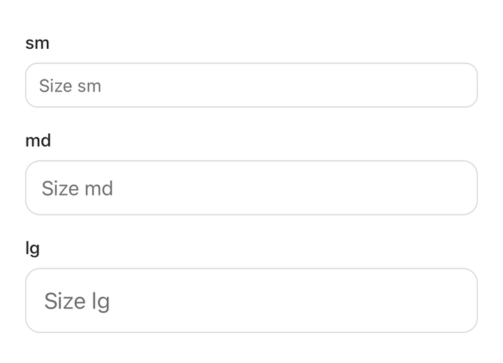
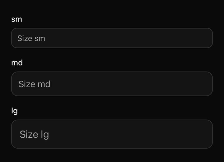
import { Field } from "@delacour/native-ui/field";import { INPUT_SIZES, Input } from "@delacour/native-ui/input";import type { ReactElement } from "react";import { View } from "react-native";export function Demo(): ReactElement { return ( <View className="gap-4"> {INPUT_SIZES.map((size) => ( <Field key={size}> <Field.Label>{size}</Field.Label> <Input placeholder={`Size ${size}`} size={size} /> </Field> ))} </View> );}A multiline field turns its height into a floor, and the row aligns to the top with it — centred decorators would drift down the side of a paragraph instead of sitting on its first line.
No label, description or error parts
Text.Label and Text.Caption already are those, and a label defined twice is a type scale that
can drift. Use Field for the surrounding structure.
API
Extends React Native's TextInputProps. placeholderTextColorClassName is withheld in favour of
placeholderColorClassName, which is the name the rest of the library uses.
Prop
Type
Input.Group
Puts a prefix or a suffix inside the input's own border, and publishes the shared axes so the input inside does not restate them.
Prop
Type
Input.Prefix / Input.Suffix
Content drawn inside the group's border, before or after the field. An Icon inside one inherits
the input's icon size and a muted foreground.
Prop
Type