Badge
A compact label for status, category or count.
import { Badge } from "@delacour/native-ui/badge";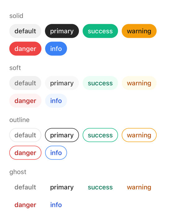
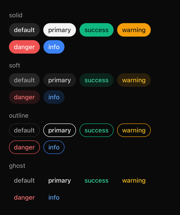
import { BADGE_COLORS, BADGE_VARIANTS, Badge } from "@delacour/native-ui/badge";import { Text } from "@delacour/native-ui/text";import type { ReactElement } from "react";import { View } from "react-native";/** * Every colour of one variant, on a row that wraps. * * The grid is built from the exported `as const` arrays rather than written out, * so a colour added to `BADGE_COLORS` appears here with no edit. */function VariantRow({ variant }: { variant: (typeof BADGE_VARIANTS)[number] }): ReactElement { return ( <View className="gap-2"> <Text.Caption color="muted">{variant}</Text.Caption> <View className="flex-row flex-wrap gap-2"> {BADGE_COLORS.map((color) => ( <Badge color={color} key={color} variant={variant}> {color} </Badge> ))} </View> </View> );}export function Demo(): ReactElement { return ( <View className="gap-4"> {BADGE_VARIANTS.map((variant) => ( <VariantRow key={variant} variant={variant} /> ))} </View> );}<Badge color="success">Active</Badge>Two axes, not one
variant says how the surface is painted — solid, soft, outline, ghost. color says what
it means — default, primary, success, warning, danger, info. Sizes: sm, md, lg.
Button collapses the two into a single enum and a badge deliberately does not: six semantic
colours are the point of this component rather than an afterthought, and one axis would need
thirteen names to say what two say with ten.
Neither axis paints a surface alone, so all twenty-four pairings live in compoundVariants. A test
asserts every cell is distinct — two cells collapsing means a caller can set an axis and see
nothing change.
Content until given something to do
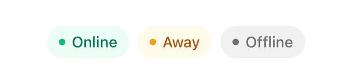
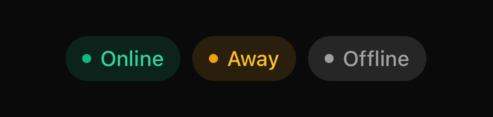
import { Badge } from "@delacour/native-ui/badge";import type { ReactElement } from "react";import { View } from "react-native";export function Demo(): ReactElement { return ( <View className="flex-row flex-wrap gap-2"> <Badge color="success" variant="soft"> <Badge.StartContent> <View className="size-1.5 rounded-full bg-success" /> </Badge.StartContent> <Badge.Label>Online</Badge.Label> </Badge> <Badge color="warning" variant="soft"> <Badge.StartContent> <View className="size-1.5 rounded-full bg-warning" /> </Badge.StartContent> <Badge.Label>Away</Badge.Label> </Badge> <Badge variant="soft"> <Badge.StartContent> <View className="size-1.5 rounded-full bg-muted-foreground" /> </Badge.StartContent> <Badge.Label>Offline</Badge.Label> </Badge> </View> );}With no onPress and no onLongPress the root is a plain View. Mounting a GestureDetector
regardless would put one under every tag in a list of fifty and announce each of them to assistive
technology as a button with no action.
Supply either handler and the root becomes a Pressable, inheriting feedback, haptic and the
rest; only the default differs — scale.
Dismissing
<Badge onClose={remove}>Design</Badge>onClose is its own pressable — a Badge.CloseButton composed in at the end — so its tap is
claimed by the inner detector and never also fires the badge's onPress. It presses with fade
rather than the root's scale: a spring on a glyph that small reads as a jitter.
Reach for the part by hand only to place it somewhere other than last.
A size is padding, never a height
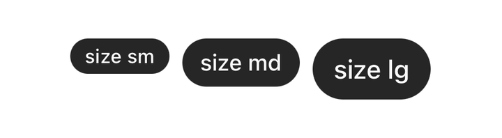

import { BADGE_SIZES, Badge } from "@delacour/native-ui/badge";import type { ReactElement } from "react";import { View } from "react-native";export function Demo(): ReactElement { return ( <View className="flex-row flex-wrap items-center gap-2"> {BADGE_SIZES.map((size) => ( <Badge color="primary" key={size} size={size}> size {size} </Badge> ))} </View> );}Text respects OS font scaling, so a fixed height clips the label at a large accessibility step
instead of growing with it. A test asserts the root carries no h-* at any size.
self-start is load-bearing. A badge is sized by its content, and inside a gap column every child
is stretch-aligned by default — without it a one-word badge spans the whole screen.
The border is reserved on every variant, transparent until outline colours it — declaring it only
where it shows would make the badge two points wider the moment a caller switched variant.
Icons and text inherit
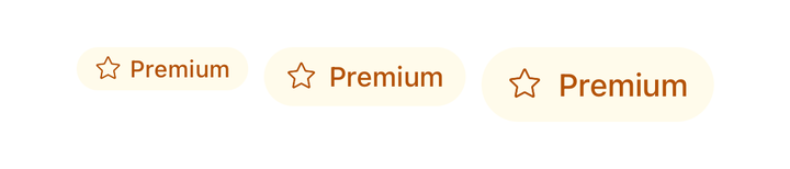

import { BADGE_SIZES, Badge } from "@delacour/native-ui/badge";import { Icon } from "@delacour/native-ui/icon";import { IconStar } from "@delacour/native-ui/icons/central";import type { ReactElement } from "react";import { View } from "react-native";export function Demo(): ReactElement { return ( <View className="flex-row flex-wrap items-center gap-2"> {BADGE_SIZES.map((size) => ( <Badge color="warning" key={size} size={size} variant="soft"> <Icon icon={IconStar} /> <Badge.Label>Premium</Badge.Label> </Badge> ))} </View> );}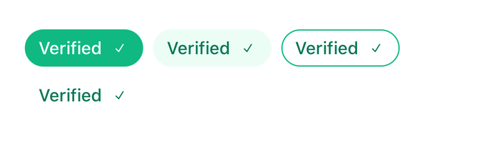

import { BADGE_VARIANTS, Badge } from "@delacour/native-ui/badge";import { Icon } from "@delacour/native-ui/icon";import { IconCheckmark1Small } from "@delacour/native-ui/icons/central";import type { ReactElement } from "react";import { View } from "react-native";export function Demo(): ReactElement { return ( <View className="flex-row flex-wrap gap-2"> {BADGE_VARIANTS.map((variant) => ( <Badge color="success" key={variant} variant={variant}> <Badge.Label>Verified</Badge.Label> <Icon icon={IconCheckmark1Small} /> </Badge> ))} </View> );}The root wraps its subtree in an IconDefaultsProvider and a TextClassProvider, so a bare
<Icon> or <Text> inside a badge comes out at the right size and colour with nothing said at the
call site. String children are wrapped in a Badge.Label automatically.
API
A badge is a Pressable, so feedback, haptic, onPress and the rest are inherited rather than
restated — see Pressable. asChild, busy and disabled are
withheld: use isDisabled, which the parts read through context.
Prop
Type
Badge.Label
The badge's text. Picks its colour and type scale from the badge's variant, colour and size.
Extends React Native's TextProps.
Prop
Type
Badge.CloseButton
The dismiss pressable. Defaults its accessibilityLabel to "Remove" and its feedback to
fade — a badge that scaled on the close button's press would flex the whole chip. Extends
PressableProps.
Prop
Type
Badge.StartContent / Badge.EndContent
Centred wrappers for leading and trailing content that is not an Icon. An Icon needs neither —
it inherits the badge's icon size and its colour from the subtree.
Prop
Type