Screen
A screen's frame — pinned chrome, a content region, and whatever scrolls between them.
import { Screen } from "@delacour/native-ui/screen";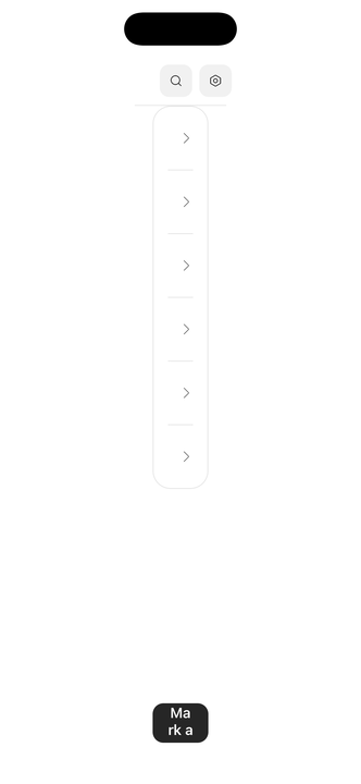
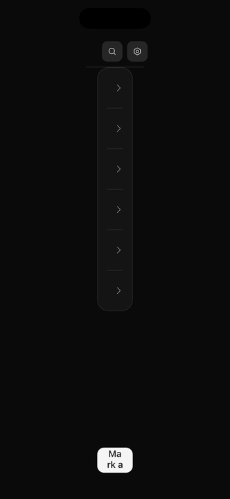
import { Button } from "@delacour/native-ui/button";import { Icon } from "@delacour/native-ui/icon";import { IconMagnifyingGlass, IconSettingsGear1 } from "@delacour/native-ui/icons/central";import { ListGroup } from "@delacour/native-ui/list-group";import { Screen } from "@delacour/native-ui/screen";import { type ReactElement, useState } from "react";import { View } from "react-native";const MESSAGES = [ { id: "ada", title: "Ada Lovelace", description: "The analytical engine has no pretensions" }, { id: "grace", title: "Grace Hopper", description: "It is easier to ask forgiveness than permission" }, { id: "alan", title: "Alan Turing", description: "We can only see a short distance ahead" }, { id: "katherine", title: "Katherine Johnson", description: "Numbers checked, ready when you are" }, { id: "margaret", title: "Margaret Hamilton", description: "The rope core memory is loaded" }, { id: "barbara", title: "Barbara Liskov", description: "A subtype should be substitutable" },] as const;/** * A root screen: an overlay navbar, a scrolling body and a footer. * * There is no back control because a root screen has nowhere to go back to — * `Screen.Navbar.BackButton` takes an `onPress` and this library wires no * router of its own, so the navigation is the app's to supply. * * The footer is the part worth watching: it measures its own content into the * screen context, and the scroll area reserves that height, so the last row * clears it with nothing said at either call site. */export function Demo(): ReactElement { const [readIds, setReadIds] = useState<string[]>([]); const unread = MESSAGES.length - readIds.length; function markRead(id: string): void { setReadIds((current) => (current.includes(id) ? current : [...current, id])); } return ( <Screen> <Screen.Navbar actions={ <> <Button accessibilityLabel="Search" isIconOnly size="sm" variant="secondary"> <Icon icon={IconMagnifyingGlass} /> </Button> <Button accessibilityLabel="Settings" isIconOnly size="sm" variant="secondary"> <Icon icon={IconSettingsGear1} /> </Button> </> } > <View className="min-w-0 flex-1"> <Screen.Navbar.Title>Inbox</Screen.Navbar.Title> <Screen.Navbar.Subtitle>{unread === 0 ? "All caught up" : `${unread} unread`}</Screen.Navbar.Subtitle> </View> </Screen.Navbar> <Screen.ScrollArea> <ListGroup> {MESSAGES.map((message) => ( <ListGroup.Item key={message.id} onPress={() => markRead(message.id)} testID={`row-${message.id}`}> <ListGroup.ItemContent> <ListGroup.ItemTitle>{message.title}</ListGroup.ItemTitle> <ListGroup.ItemDescription> {readIds.includes(message.id) ? "Read" : message.description} </ListGroup.ItemDescription> </ListGroup.ItemContent> <ListGroup.ItemSuffix /> </ListGroup.Item> ))} </ListGroup> </Screen.ScrollArea> <Screen.Footer> <Button haptic="medium" isDisabled={unread === 0} onPress={() => setReadIds(MESSAGES.map((message) => message.id))} testID="mark-all-read" > Mark all as read </Button> </Screen.Footer> </Screen> );}<Screen>
<Screen.Navbar>
<Screen.Navbar.BackButton onPress={router.back} />
<Screen.Navbar.Title>Settings</Screen.Navbar.Title>
</Screen.Navbar>
<Screen.ScrollArea>{children}</Screen.ScrollArea>
<Screen.Footer>
<Button onPress={save}>Save</Button>
</Screen.Footer>
</Screen>The point of the component
The navbar and footer measure themselves into a Reanimated context, and every scrollable reserves exactly that. No screen carries a hand-tuned padding number that is right on one device and wrong on the next.
The reserves are spacer views whose height is an animated style, not content-container padding — padding cannot animate on the UI thread, and the heights are only known after layout.
Placement, not variant
overlay (the default) floats the chrome over the content, which insets itself to match. static
puts it in the flow. In this package variant always means a visual variant, so the axis that
decides where a part sits gets its own name.
A static footer is opaque; an overlay footer is not — content is meant to scroll under it, and
whatever you put inside brings its own surface.
Parts
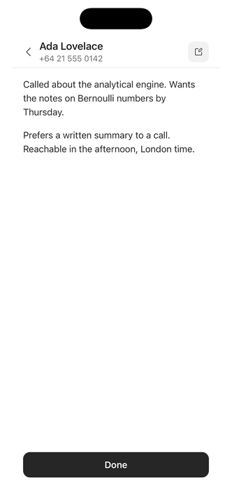
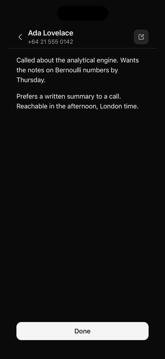
import { Button } from "@delacour/native-ui/button";import { Icon } from "@delacour/native-ui/icon";import { IconEditSmall1 } from "@delacour/native-ui/icons/central";import { ListGroup } from "@delacour/native-ui/list-group";import { Screen } from "@delacour/native-ui/screen";import { Text } from "@delacour/native-ui/text";import { type ReactElement, useState } from "react";import { View } from "react-native";const NOTES = [ "Called about the analytical engine. Wants the notes on Bernoulli numbers by Thursday.", "Prefers a written summary to a call. Reachable in the afternoon, London time.",];/** * Two screens and the control that moves between them. * * `Screen.Navbar.BackButton` takes an `onPress` rather than calling a router * itself — the library has no navigation dependency — so here it swaps a piece * of local state instead. In an app that handler is `() => router.back()`. * * It opens on the pushed screen so the back control has somewhere to go. */export function Demo(): ReactElement { const [isPushed, setPushed] = useState(true); if (!isPushed) { return ( <Screen> <Screen.Navbar> <View className="min-w-0 flex-1"> <Screen.Navbar.Title>Contacts</Screen.Navbar.Title> </View> </Screen.Navbar> <Screen.ScrollArea> <ListGroup> <ListGroup.Item onPress={() => setPushed(true)} testID="row-ada"> <ListGroup.ItemContent> <ListGroup.ItemTitle>Ada Lovelace</ListGroup.ItemTitle> <ListGroup.ItemDescription>+64 21 555 0142</ListGroup.ItemDescription> </ListGroup.ItemContent> <ListGroup.ItemSuffix /> </ListGroup.Item> </ListGroup> </Screen.ScrollArea> </Screen> ); } return ( <Screen> <Screen.Navbar actions={ <Button accessibilityLabel="Edit" isIconOnly size="sm" variant="secondary"> <Icon icon={IconEditSmall1} /> </Button> } placement="static" > <Screen.Navbar.BackButton onPress={() => setPushed(false)} testID="back"> <View className="min-w-0 flex-1"> <Screen.Navbar.Title>Ada Lovelace</Screen.Navbar.Title> <Screen.Navbar.Subtitle>+64 21 555 0142</Screen.Navbar.Subtitle> </View> </Screen.Navbar.BackButton> </Screen.Navbar> <Screen.ScrollArea contentContainerClassName="gap-4"> {NOTES.map((note) => ( <Text className="text-foreground" key={note}> {note} </Text> ))} </Screen.ScrollArea> <Screen.Footer sticky> <Button haptic="medium" onPress={() => setPushed(false)} testID="done"> Done </Button> </Screen.Footer> </Screen> );}| Part | What it is |
|---|---|
Screen.Navbar | Pinned top chrome. Compound: .Title, .Subtitle, .BackButton |
Screen.Content | The content region between the chrome |
Screen.View | A non-scrolling body |
Screen.Header | A scrolling header inside the content region |
Screen.Footer | Pinned bottom chrome, keyboard-aware |
Screen.ScrollArea | A ScrollView with the reserves applied |
Screen.FlatList / .SectionList / .LegendList | Virtualised lists, same reserves |
Screen.ChatList | An inverted or oldest-first chat list |
Screen.Loading / Screen.Error | Whole-screen states |
Chat lists
Screen.ChatList is a discriminated union on variant. legend (the default) takes chronological
oldest-first data and LegendList's own renderItem; flat is an inverted FlatList with
newest-first data and React Native's.
The two renderItem contracts genuinely differ, so each variant exposes its engine's own rather
than adapting one into the other — an adapter would have to fabricate the separators object RN's
signature promises, and nothing would honour it.
Seed a chat list with composerBaseHeight
The footer publishes its real height a commit or two after the list's first layout, and the list has already scrolled to the end by then. Without the seed the newest message hides under the composer — intermittently, which is the worst kind of wrong.
Borders
Both hairlines are drawn at rest. fadeBorderOnScroll — the same prop name on Screen.Navbar and
Screen.Footer — opts into a scroll-linked ramp instead.
The two read opposite ends of the scroll: the navbar's answers "is there content above?" and
brightens as you leave the top, while the footer's answers "is there content below?" and fades out
as the content runs out. One SCREEN_BORDER_FADE_DISTANCE drives both.
Debugging
<Screen debug> paints every layer. Opt-in per screen and deliberately not gated behind
__DEV__, so a reserve can still be inspected on a release build.
The green occupancy band's edge must land on the footer's red one; a red sliver past it means the
reserve is short. SCREEN_DEBUG_COLORS is exported so a composer can paint matching bands.
Requirements
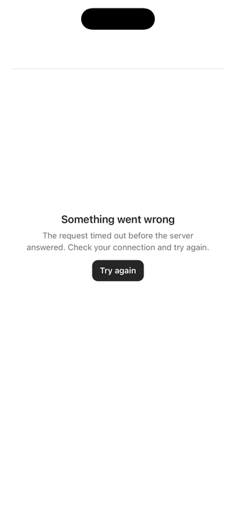
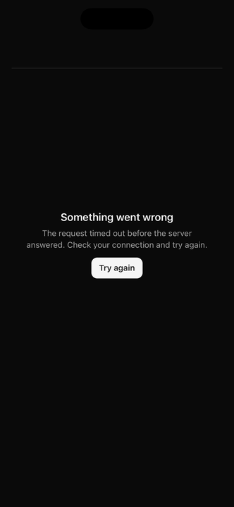
import { Button } from "@delacour/native-ui/button";import { Screen } from "@delacour/native-ui/screen";import { type ReactElement, useEffect, useState } from "react";/** How long the retry spins before failing again. */const RETRY_MS = 1400;/** * `Screen.Loading` and `Screen.Error`, returned in place of a route's content. * * Neither takes an `onBack` here: this is a root screen, and omitting the * handler renders the navbar without a back control rather than dropping the * bar — which is what keeps the frame from shifting between the three states. * * Nesting either inside another `Screen` is safe too. The provider passes the * outer context through rather than shadowing it. */export function Demo(): ReactElement { const [isLoading, setLoading] = useState(false); useEffect(() => { if (!isLoading) return; const timer = setTimeout(() => setLoading(false), RETRY_MS); return () => clearTimeout(timer); }, [isLoading]); if (isLoading) return <Screen.Loading title="Inbox" />; return ( <Screen.Error message="The request timed out before the server answered. Check your connection and try again."> <Button haptic="medium" onPress={() => setLoading(true)} size="sm" testID="try-again"> Try again </Button> </Screen.Error> );}The app must mount DelacourProvider at its root. Screen
reads the safe-area and keyboard providers, and <KeyboardStateSync /> is what keeps the keyboard's
shared values honest between screens.
Safe-area insets come from useSafeAreaInsets(), never from Uniwind's *-safe utilities — those
compile to env(safe-area-inset-top), which resolves to zero on React Native. The class
applies, nothing moves, and a navbar draws over the status bar with no error anywhere.
No navigation dependency
Screen.Navbar.BackButton takes an onPress; wire router.back() yourself. Screen.Footer's
isFocused is the same trade: an app with a router passes useIsFocused(), and without one the
footer behaves as focused.
There is no Navbar.Action — Button already owns that vocabulary, so a navbar action is
<Button isIconOnly size="sm" variant="secondary">.
Optional peer
@legendapp/list is peerDependenciesMeta.optional, so an app that never imports Screen never
resolves it.
API
Screen is the root. It renders a View and passes ViewProps through.
Prop
Type
Shared shapes
Three prop shapes are shared between parts rather than restated, which is why the tables below are short.
Prop
Type
Screen.Navbar
Pinned chrome at the top. Publishes its measured height, which is what everything below it clears.
Prop
Type
Screen.Footer
Pinned chrome at the bottom, and the part that rides the keyboard.
Prop
Type
Screen.Content / Screen.Header / Screen.View
Content and Header take ScreenInsetProps; View is a plain ViewProps box that clears the
chrome without scrolling.
Prop
Type
The scrollables
Screen.ScrollArea, Screen.FlatList, Screen.SectionList, Screen.LegendList and
Screen.ChatList each extend their underlying list's own props plus ScreenScrollableProps. They
insert the navbar and footer spacers for you, so content clears the chrome without a manual
contentContainerStyle.
Prop
Type
Screen.Error / Screen.Loading
Whole-screen states, each with its own navbar so a back gesture still works.
Prop
Type
Screen.NavbarBackButton
A Pressable, so the vocabulary is inherited. onPress is required: a back button that does
nothing is worse than none.
Prop
Type
Screen.NavbarTitle / NavbarSubtitle / NavbarBackground / FooterBackground
The two text parts are Text presets and take its props. The two background parts take ViewProps
and exist for a surface that has to sit behind the chrome rather than inside it — reach for
backgroundClassName on the navbar first.
Prop
Type